Designing the Next Generation Enterprise
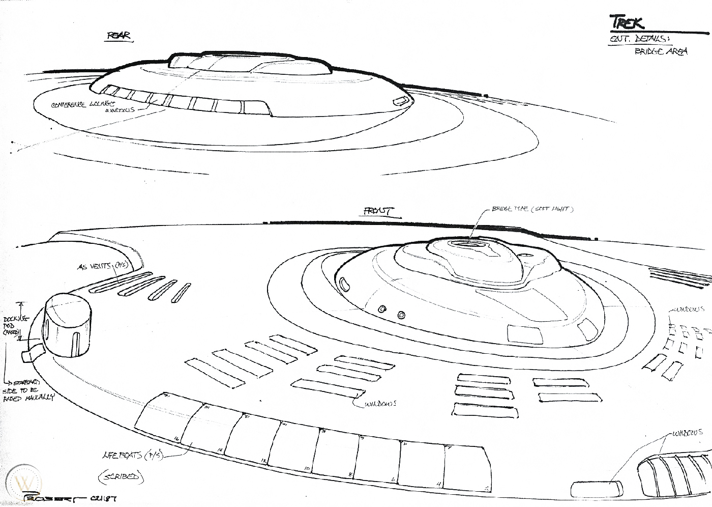
When it came time to design a new Starship Enterprise, history did not repeat itself. Where Matt Jefferies had produced hundreds of sketches to come up with the design of the first Enterprise, Andrew Probert had a basic formula in mind before he was even hired for the job.
After working on The Motion Picture in 1978, and before a second Star Trek television series was even announced, Probert had painted a future starship strictly for his own enjoyment. When he interviewed for the position of senior illustrator on the new show in 1985, Probert said he was “so pumped up” that he started making more drawings as soon as he came home.
Knowing that the second series would be set about a century after the first, Probert felt the new Enterprise should be faster and probably sleeker. “At least it should be more elegant.”


Filling in details
When Probert was hired, it was to design the new Enterprise’s bridge and other sets. The task of designing the ship itself fell to him by happenstance. Probert brought that painting of a future starship with him to his Paramount office. One day, Story Editor David Gerrold walked in, saw the design and took it to Gene Roddenberry, who approved it on the spot.
All that remained was filling in the details.


“The saucer had, since its inception, been the main section,” Probert explained, “so I made it larger in proportion to the secondary or engineering hull.”
In previous designs the warp nacelles were always to the rear but above the saucer rim, which visually seemed to give them equal importance and physically placed them above the ship’s center of mass. Both of these seemed to be negative points, which I hoped to remedy by lowering them to a position between the two hull sections. This would place them closer to the ship’s center of mass.

Also the struts holding the saucer and warp engines were slanted in opposite directions; the saucer is going forward, engines going back. That wasn’t bad, but it created a slight visual conflict, so I slanted them all forward to unify their direction and give the overall design a feeling of aggressive forward movement, like a lunging cat. The view from the front of the old ship produced a variety of shapes. I took my design theme from the saucer and started sketching every component as a compressed oval.

Probert’s final design had relatively short nacelles to suggest that warp technology had become more powerful. Roddenberry didn’t like it: “He was so used to those huge warp engines from The Original Series that this seemed underpowered to him.”
My whole intent on this ship was to unify all of those shapes; I wanted to give it a forward lunge for the saucer and a forward lunge for the engines, but Gene still wanted the engines to extend out the back as well.
Roddenberry’s only other change was to put the bridge back on top of the saucer. Given the size of the new ship, this only added a small bump. But it gave the viewers a sense of scale.

On the underside of the saucer, Probert inserted a captain’s yacht. Although the Enterprise-D’s was never seen on screen, it became a staple of Starfleet design. Rick Sternbach included a captain’s yacht in his design of Voyager and the Enterprise-E’s captain’s yacht was revealed in Insurrection.


Miniatures
Industrial Light and Magic built two miniatures for the first season: a large 6-foot model and a smaller, less detailed 2-foot model. Both were capable of saucer separation.


Greg Jein built a new, 4-foot miniature for Season 3. It had more pronounced hull plating and a thicker saucer rim to match the new Ten Forward set. Probert — who by then had left the show — had designed the saucer to be one deck in height.
Jein’s model largely replaced the other two, but stock footage from the first two seasons continued to be used, creating a visual discrepancy. The 6-footer was refurbished for Star Trek Generations, when a computer-generated version and a special 12-foot-wide saucer (for the crash) were also made.


4 comments
Submit comments by email.