Designing Voyager’s Crew Quarters

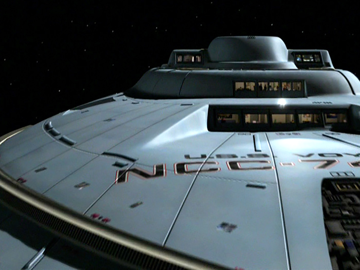
Rick Sternbach’s blueprints placed the crew quarters of Voyager around Decks 4 to 8 in the upper saucer section. As on Star Trek: The Next Generation, the Art Department adopted a modular design that could be adapted as needed for each member of the crew or a ship’s guest on an episode-by-episode basis.
Production Designer Richard James told Star Trek: The Magazine that the main set, situated across the mess hall on Paramount’s Stage 9, was permanent, but that the interior walls had beams across the top with channels where walls could slide in and out.
Each segment we called a “bay”. Because the design was modular, you could give it two bays, three bays or one bay. How big it was would depend on the importance of the character. Of course, Janeway had, I think, four bays. The beams made niches in the walls and a lot of the furniture could play into those niches and come and go.

Sternbach told Forgotten Trek in 2007 that the fifth window of Janeway’s quarters, which are below the mess hall’s, presumably look into the bathroom.
Each character had their own furnishing, James said:
There were some elements that were the same, but we would give everyone something different so the rooms had a personality.
There was another set on Stage 9 without windows, implying it was deeper inside the ship. This was also a redress of the quarters that had been used in The Next Generation, in this case for junior officers and enlisted crew.
