The Unseen Enterprise-D
Star Trek: The Next Generation already required more sets than the average television show. It had to cannibalize whatever it could from the motion pictures and Gene Roddenberry wrote two superfluous scenes in main engineering into “Encounter at Farpoint”, knowing that such a large set might never be built if it wasn’t required for the pilot.
Inevitably many parts of the Enterprise-D went unseen: the main shuttlebay, the many observation lounges that presumably line the saucer, Cetacean Ops…
Fortunately we can draw on the work of Star Trek veterans and fans to get a more complete picture of the Galaxy-class starship. Here is a tour of the unseen Enterprise-D.
Main shuttlebay

For budget reasons, The Next Generation never showed the enormous main shuttlebay that is supposed to take up the bulk of Decks 3 and 4 in the saucer section.
Rick Sternbach, who had worked as an illustrator on Star Trek: The Motion Picture, and who would go on to design many of the props and starships that appeared in The Next Generation and Voyager, drew up the layout of the main shuttlebay in the Star Trek: The Next Generation U.S.S. Enterprise NCC-1701-D Blueprints, which were at least partly based on the blueprints Ed Whitefire had prepared earlier in the 1990s but which weren’t licensed. (You can view those at Cygnus-X1.Net.)
It shows a vast complex with about two dozen shuttles, a bunch of workbees, repair shops, fueling stations, cargo processing bays and a central control tower.
Rob Bryan and Stage 9 studio visualized the main shuttlebay for their aborted virtual-reality tour of the Enterprise-D. Unfortunately, CBS put a stop to their project, citing copyright, but we still have the pictures.


Lounges
Andrew Probert allocated many windows on the Enterprise-D model for observation decks. Having such a large vessel with families, singles, lovers and loners aboard, Probert envisioned those areas as comfortable places where people could go and relax.
“They were simply lounges,” he told Trekplace in 2005, “and they were different sized, ranging from a two-person lounge to a fourteen-person lounge, where you could have family gatherings or parties and they would all be very darkly lit, so you wouldn’t get gross window reflections, allowing you to see outside a lot easier.”
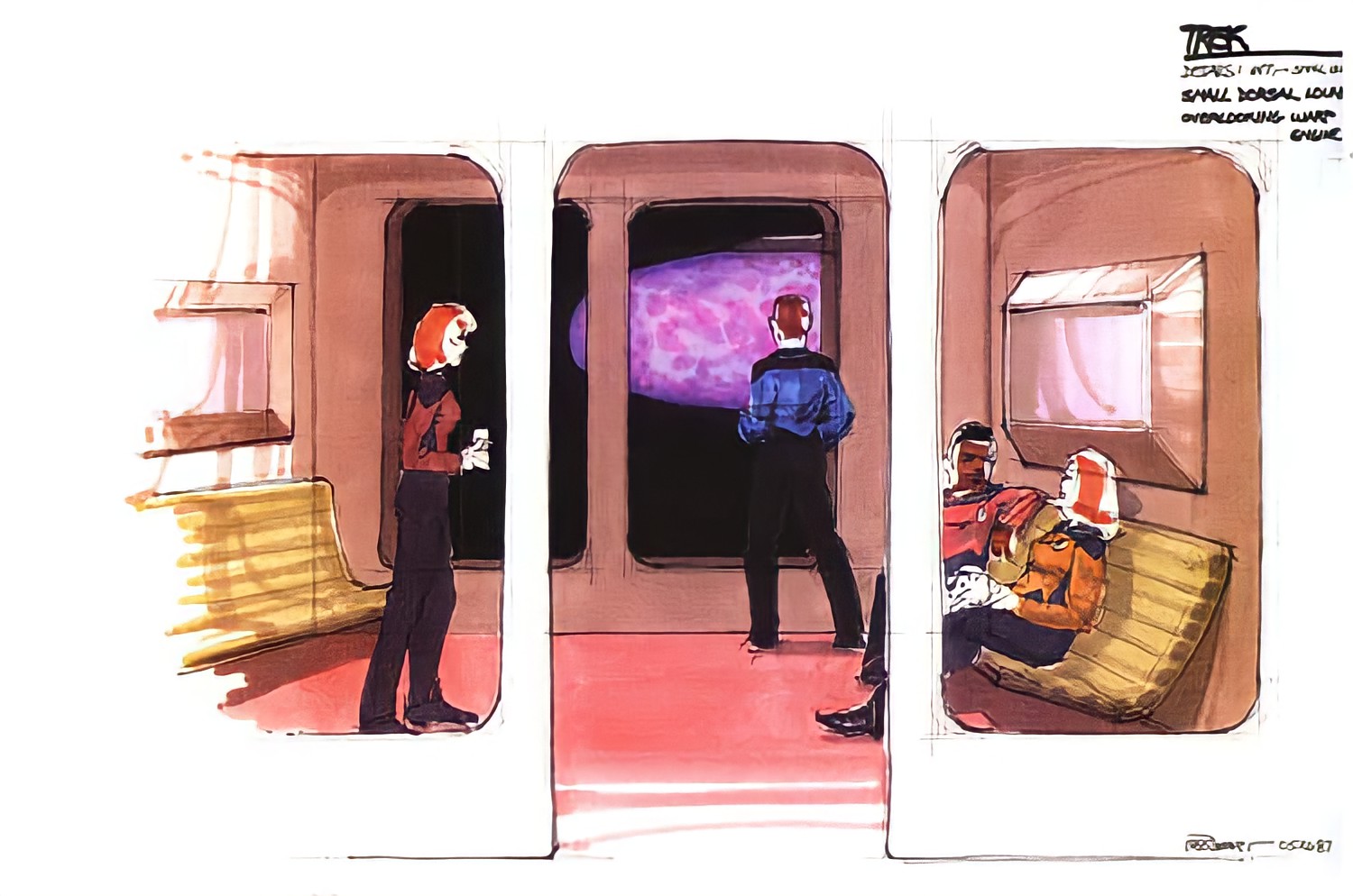
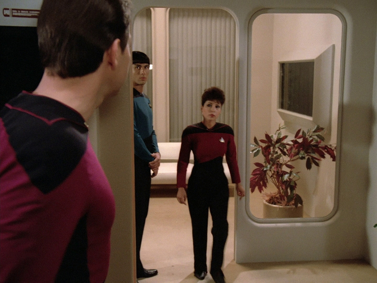
Some of those lounges were seen in the first season, including a small four-person lounge in “Encounter at Farpoint” (which was a redress of Dr Crusher’s office) and a Starboard Lounge in the episode “Justice” (for which the crew quarters’ set was used).
After Ten Forward premiered in the second season, no other lounges were seen anymore.


Stage 9 as well as Jason B., whose similar Enterprise-D Construction Project was also shut down by CBS, gave us a glimpse of what might have been. They put small lounges on the lower Deck 1, in front of the bridge, a Two Forward behind the large observation windows on Deck 2 and a Nine Forward above Ten Forward in the front of the saucer.

Probert envisioned another lounge behind the four large windows in the underside of the saucer section. He provided Trekplace with a mockup of what this would look like.
Sternbach instead placed a secondary deflector dish in this area in his Star Trek: The Next Generation U.S.S. Enterprise NCC-1701-D Blueprints.
Observation Lounge ramp
A ramp is meant to connect the Enterprise bridge with the observation lounge, which is situated about half a deck lower.
In the real world, the reason we never saw direct scenes between the two sets is that they were disconnected. Picard’s ready room, by contrast, really was adjacent to the bridge.


In Stage 9’s visualization, the ramp became a small staircase flanked by relief sculptures of previous ships named Enterprise. These were initially mounted on the wall of the observation lounge but disappeared between the fourth and the fifth seasons.
Cetacean Ops
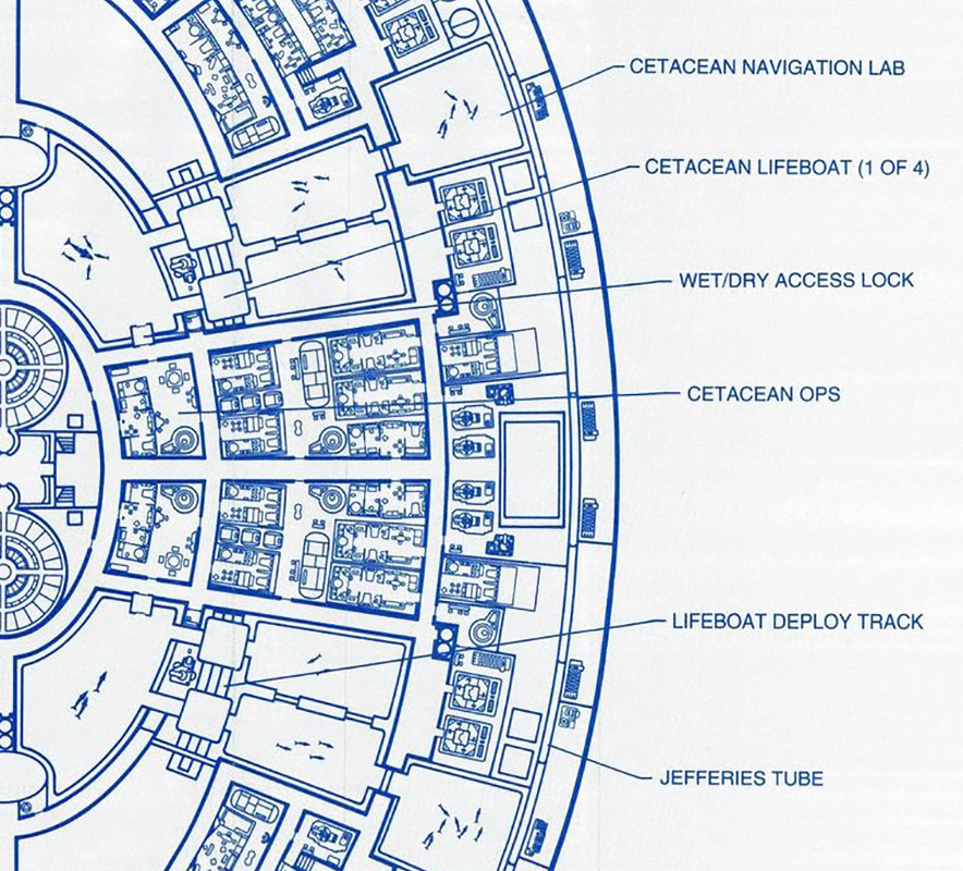
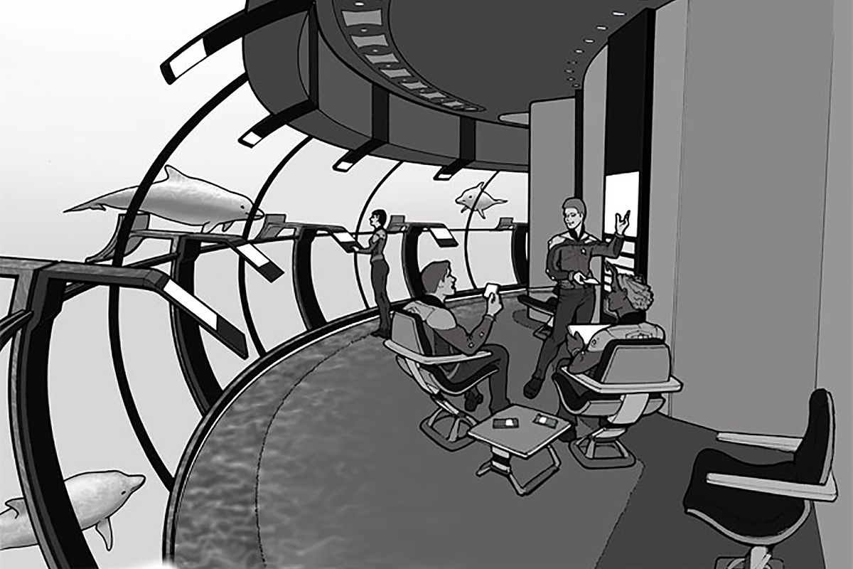
Cetacean Ops is referred to twice on the show — in “The Perfect Mate” and “Yesterday’s Enterprise”. In the Star Trek: The Next Generation Technical Manual, Sternbach and Michael Okuda write that the section is manned by a crew of dolphins and two supervising whales, who aid the Enterprise in its navigation.
In the Blueprints, Sternbach places Cetacean Ops on Decks 13 and 14 in the forward section of the saucer. Probert provided a concept for Star Trek Online in 2005. Click here to learn more.
Medical Deck
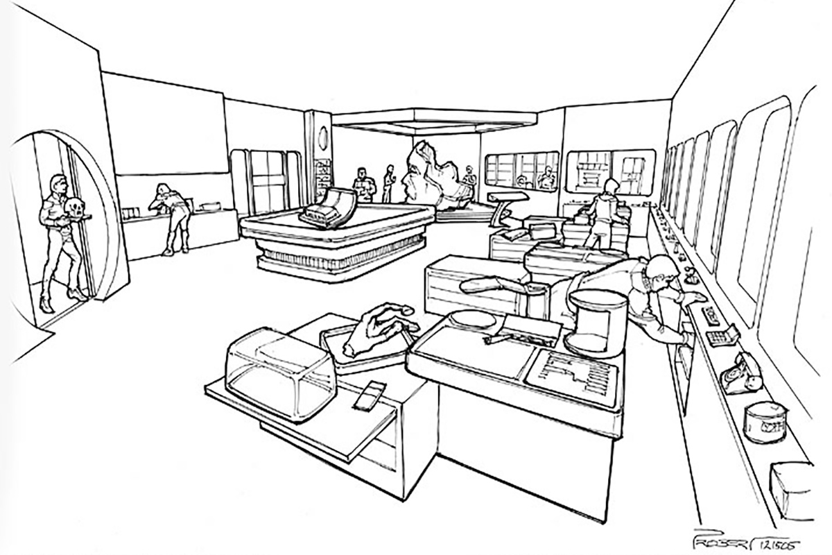
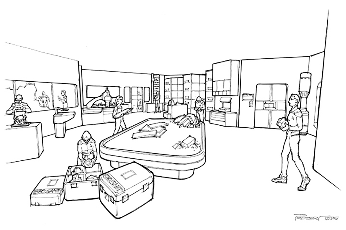
Probert’s main contribution to Star Trek Online was the design of a large medical deck.
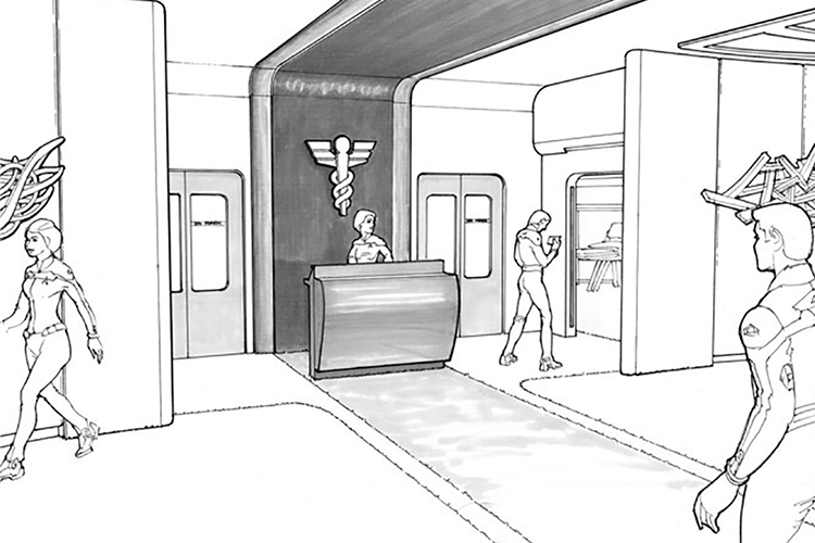
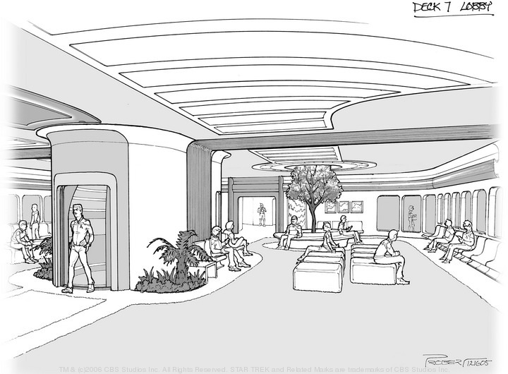
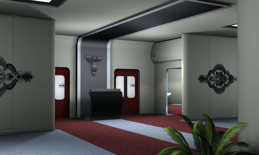
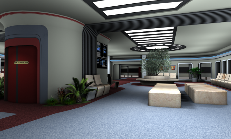
With up to one thousand people on board, a Galaxy-class starship could hardly suffice with the four biobeds and one surgical theater we saw on the show.
In the episode “Tapestry”, it is revealed there are in fact three sickbay wards on the ship. “Ethics” makes reference to private recovery rooms. Other episodes mention a diagnostics center, medical labs, a morgue and a nursery.

Probert’s design includes many of these facilities as well as a spacious reception area. Gareth John Williams visualized two of Probert’s sketches.
Click here to learn more about the Galaxy-class medical deck that wasn’t.
Sternbach places all medical facilities on Deck 12 in his Blueprints. The sickbay we see on the show is only a small “primary ICU” of a much larger complex that includes a biohazard ICU, isolation rooms, surgical suite and trauma stasis unit.
Labs
Other areas Probert designed for Star Trek Online included an archeology and a geology lab.
Mall

Ed Whitefire placed a five deck-high mall or “grotto” in the front of the saucer section that seems to have been intended as a mix of arboretum and recreation deck. I don’t believe anybody has visualized it.
Arboretum
Whitefire placed a large, two-deck-high “organic storage” facility behind the large blue windows that are below the doors of the main shuttlebay on Decks 5 and 6. Sternbach, in his Blueprints, puts the arboretum here, as does Alexander Richardson, although the arboretum seen in “Data’s Day”, “Imaginary Friend” and “Dark Page” didn’t have large windows. Maybe that was only part of a larger complex, though?


Probert told Trekplace in 2005 that he designed those windows for observation lounges.
Ryan T. Riddle and Mark Farinas place a large arboretum in the back of the saucer of their Ambassador-class starship in “The Word of God” with a lobby reminiscent of Probert’s design for Star Trek Online.


Computer Cores
“Evolution” showed us a computer access room, but the cores themselves (the Enterprise-D is supposed to carry three) were never seen.


In his concept art for Star Trek Online, Probert places two computer cores side by side in the saucer section. The third is in the stardrive section.
Captain’s yacht

Probert included a “captain’s yacht” in the bottom of the saucer, which Picard could presumably use for personal missions. He volunteered several ideas to show it in the first season of The Next Generation, but budgetary constraints made this impossible.
The only view of the yacht, called Calypso, we have is from Probert’s contribution to the 2010 Ships of the Line calendar. If you look closely, you can see Captain Picard sipping tea behind one of the windows as his yacht is being hauled in.

8 comments
Submit comments by email.