Interview with Andrew Probert
Andrew Probert’s first contact with Star Trek came in 1978, when he was hired as a concept designer and illustrator on Phase II, the aborted second television series that became The Motion Picture. He worked under Art Director Richard Taylor and contributed to all the space hardware that appeared in the movie, including the refit Enterprise.
When Gene Roddenberry was finally able to make a second Star Trek television show in 1987, Probert was hired again — to design the new Enterprise, inside and out, as well as many of the spaceships that appeared during the first season of The Next Generation.
In the summer of 2005, Forgotten Trek reached out to Probert with questions about the Enterprise-D’s interiors. Here are his answers.
Interview

Your first task upon being hired for Star Trek: The Next Generation was to provide concepts for the design of the new bridge. An early writers’ bible described the new bridge as combining “the features of ship control, briefing room, information retrieval area and officers wardroom. In other words, much the same kind of things happen here as in the old bridge, but with less emphasis on the mechanics of steering the starship.” How can we see this less mechanical approach in your early sketches?
For one thing, there were fewer monitoring stations, and the ones that were there were placed in a less important position at the back. Gene [Roddenberry] really wanted the ship run by only the “Conn” and “Ops” positions, forward, with a bridge officer in charge… a total of three people. Whenever a crisis would arise, more people would report to their rear bridge stations. They never showed this.
Some of your preliminary designs feature viewing couches and even a conference table. Was this the thinking at the time or were these your inventions?
The couches were my idea, to provide more of a face-to-face conference environment for the main characters. The table idea (generated by the producers) I hated, because it wouldn’t be logical to furnish a table where everyone would gather to discuss their situations.
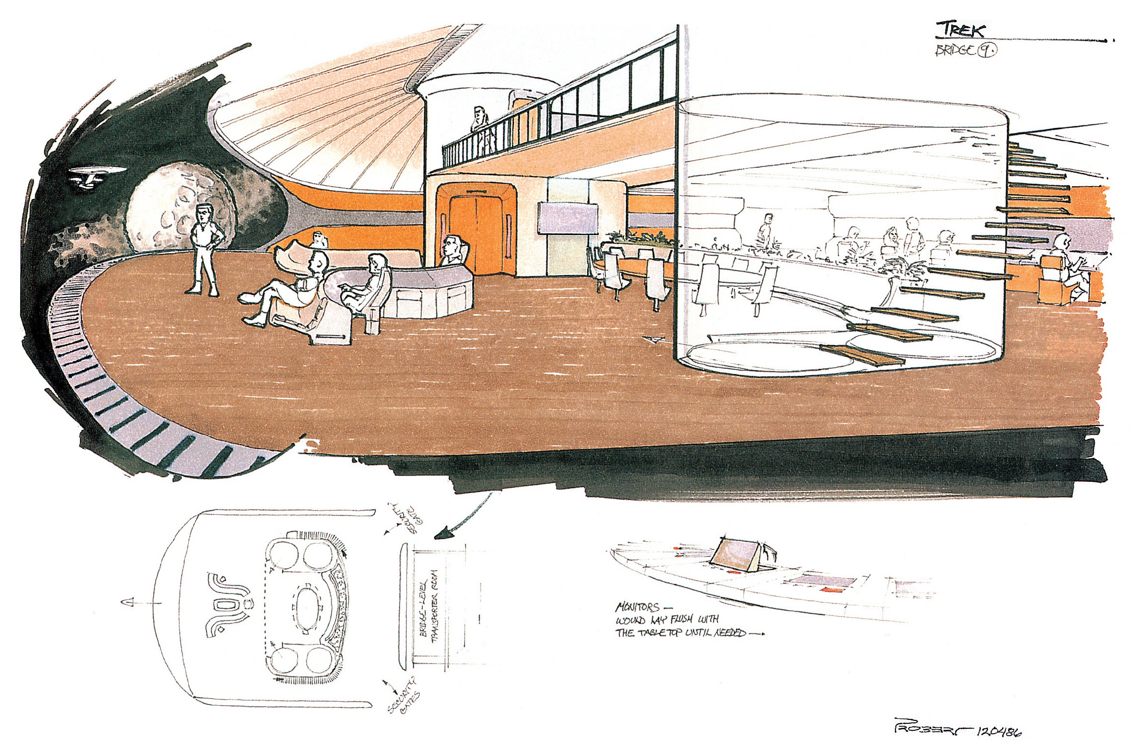
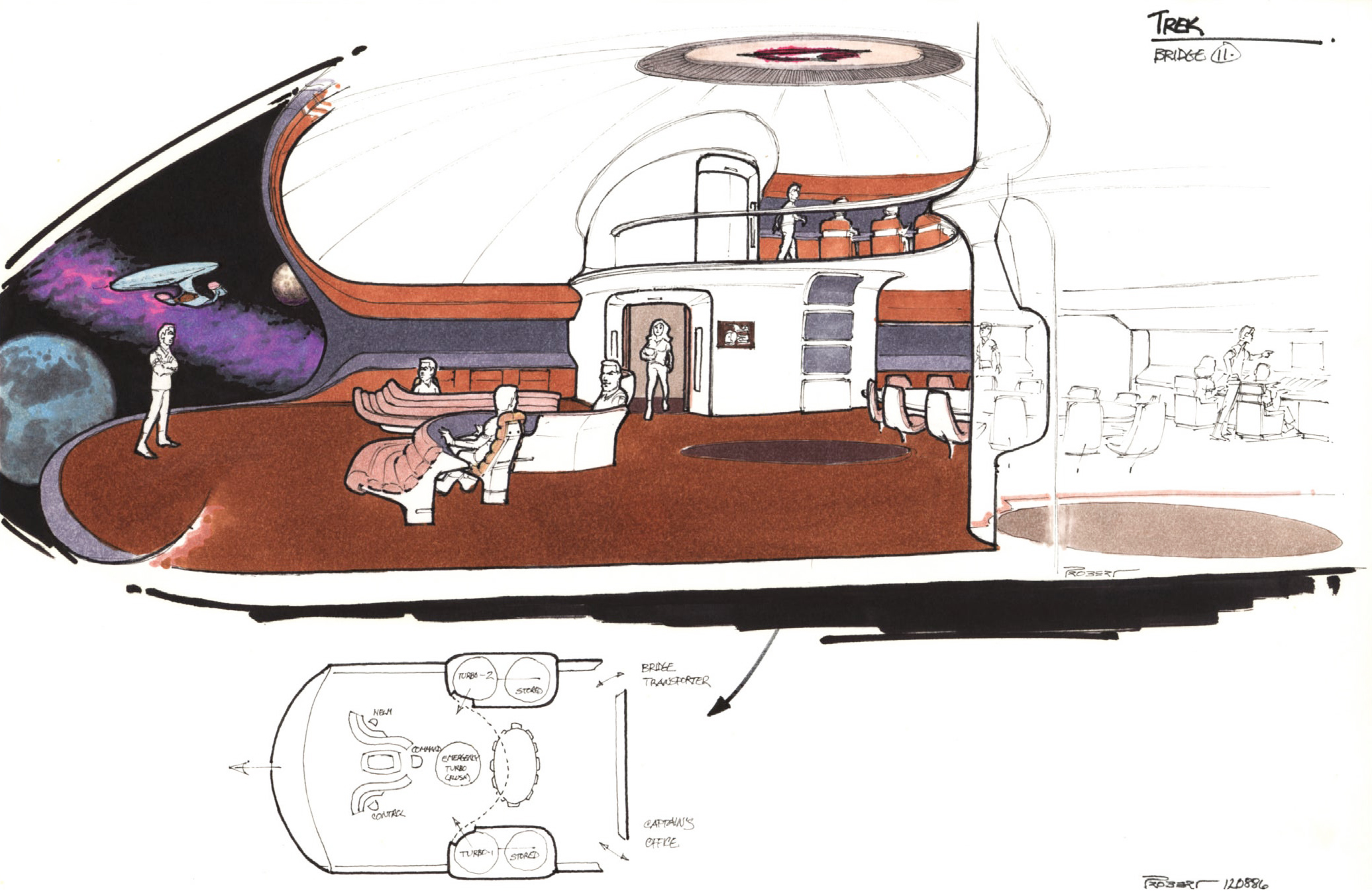
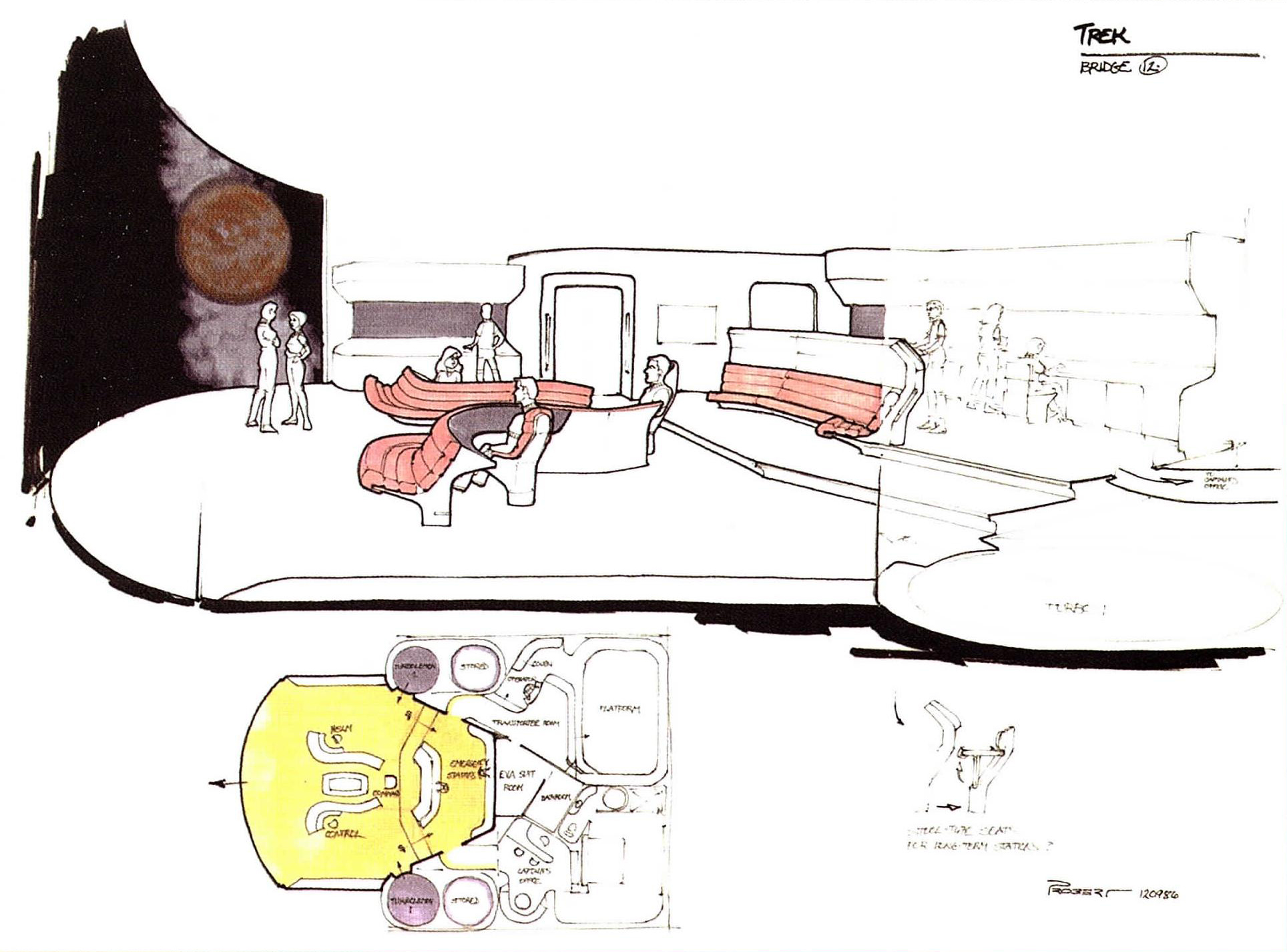
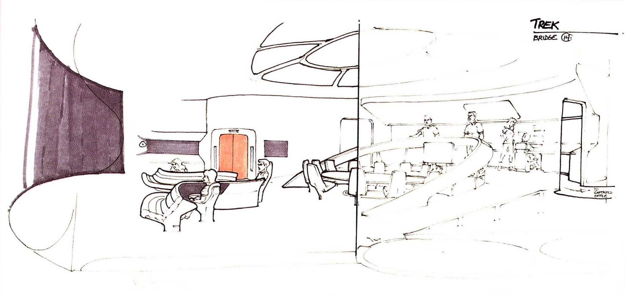
According to The Art of Star Trek, set designers, under Herman Zimmerman’s direction, were careful to incorporate wall angles and window shapes that would correspond to those on the miniature of the Enterprise-D…
With my support, Herman did pay attention to that important detailing.
Was this a major concern of yours and how did you achieve this?
This is always my first concern, to fit the interiors into the exterior design, or to design the exterior to encompass the interiors.
I hated Ten Forward, because it destroyed the scale of the ship. Besides, I specifically designed large windows clusters all over the ship for that purpose… large lounge spaces. Still, if they had insisted on yet another lounge in that saucer-nose position, it would have worked to leave the windows the way they were (at the scale they were) or they could have been modified without alluding to that space being half of the saucer rim’s height.
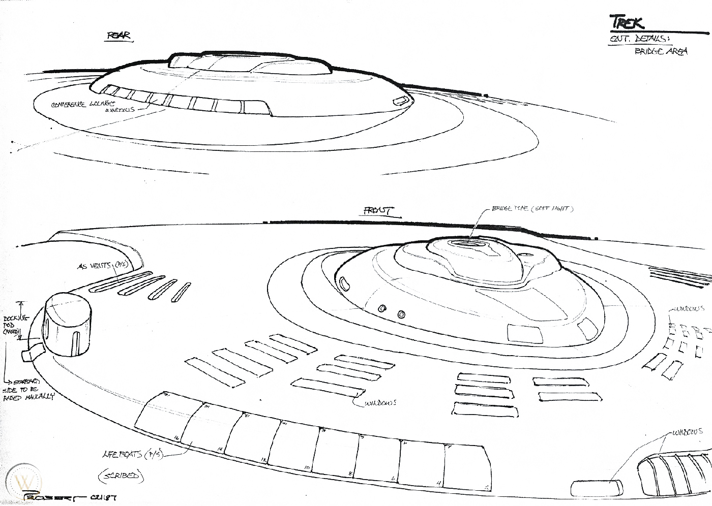
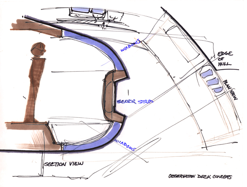
And there is a lot of talk about how much space the crew has… but that was Gene’s idea, and one of the very few that simply didn’t work for me. I told Gene that the Galaxy class was designed for a normal complement of 3,600 to 3,800 with a maximum of 8,000. Gene said that the show couldn’t afford the number of background extras it would take to reflect that crew number, so he simply stated for the record that there were 1,100 people aboard.
I always wondered why we never got to see more lounges besides Ten Forward.
Cheap production costs. Forget logic here.
Was a recreation room similar to the one in The Motion Picture ever considered for The Next Generation?
Only in regard to my exterior window planning.
