Designing the Next Generation Bridge

Andrew Probert’s first job as senior illustrator for Star Trek: The Next Generation was to provide concepts for the new bridge.
The reason, he told Trek Brasilis in 2001, was that “the bridge was going to be the central set,” and Gene Roddenberry and his team “wanted to make sure they were very happy with it, and they wanted to have plenty of time to make any changes they needed to.”
An early writers’ bible described the bridge as combining “the features of ship control, briefing room, information retrieval area and officers wardroom. In other words, much the same kinds of things happen here as in the old bridge, but with less emphassis on the mechanics of steering the starship.”
This approach inspired the presence of couches and even a conference table in early sketches.


The couches were Probert’s idea, “to provide more face-to-face conference environment.” But he didn’t care for the table, which was the producers’ suggestion. It didn’t make sense “to furnish a table where everyone would gather to discuss their situations” on the bridge, he told Forgotten Trek in 2005.
The upper, or mezzanine, level in his early-December 1986 designs would have contained various work stations. “When Gene was first talking about having a very large area, and he was looking at an information retrieval area, I just imagined a huge area that would have all these stations where all this information could come in and then it would somehow be passed on down to command people,” Probert recalled in another interview years later.

Such stations were later put at the back of the bridge, and they were reduced in number to give Picard’s Enterprise a more sophisticated appearance than Kirk’s. In order to show that technology had advanced in the century since The Original Series, the new Enterprise would be controlled by fewer people.
Gene [Roddenberry] really wanted the ship run by only the “Conn” and “Ops” positions, forward, with a bridge officer in charge… a total of three people.
In the event of a crisis, Probert explained, “more people would report to their rear bridge stations.” This was seldom shown on screen.
Two other elements that were never used were the panels on either side of the bridge, which Probert imagined contained emergency equipment and supplies, and the food replicators. On The Original Series, Kirk and his officers had sometimes been served coffee on the bridge. Picard took tea in his ready room.
Ryan T. Riddle and Mark Farinas took Probert’s two-level design as inspiration for the bridge of their Ambassador-class starship in the webcomic “The Word of God”.

Tadeo D’Oria created his own version of this design:


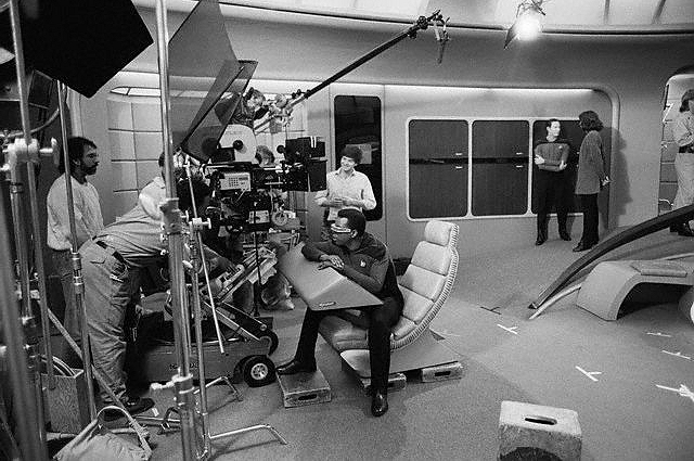
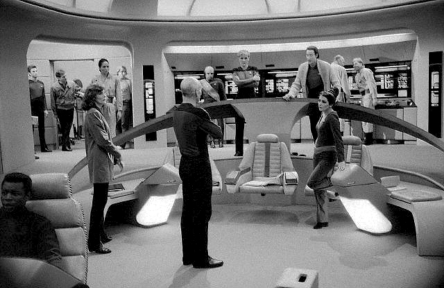
Bridge set
The set of the Enterprise bridge was erected on Paramount’s Stage 8. During the first season, the bridge and officers’ quarters were the only Star Trek sets on that stage. Ten Forward was added the following year, as was a separate observation lounge. During Season 1, sickbay had doubled as observation lounge.


Unlike the in-series configuration, the observation lounge set was never linked to the bridge. This is why we didn’t see continuous scenes between the two. Presumably a ramp, or small staircase, connects the bridge to the observation lounge in the Star Trek universe. See The Unseen Enterprise-D for more.


Generations upgrade
Several changes were made to the set during the seven-year run of The Next Generation. The small seats on either side of the three large chairs in the command area were changed several times, as did the carpeting. The wooden panels on the sides of the bridge were replaced with beige fabric in Season 2 and grey fabric in Season 3. The Conn and Ops consoles were tilted outward to place them parallel to the viewscreen and given swivel chairs that allowed the actors to sit up straight and turn around. Tadeo D’Oria and Bernd Schneider have kept track of all these changes at Ex Astris Scientia.
For Star Trek Generations, Production Designer Herman Zimmerman and Art Director Sandy Veneziano darkened the set’s colors and added more tones to its palette. They also chose richer textures.


According to John Eaves, who was invited to the Generations art team by Zimmerman, the idea was to make the bridge appear more functional. “To accomplish that,” he writes in Star Trek: The Next Generation Sketchbook, The Movies, “we raised the captain’s chair slightly (symbolically putting his authourity higher than those sitting in the two chairs flanking him).”
For functionality, we also split the ramps on either side of the command center. We still had a ramp going down, but added two elevated stations, one against either wall, where crew members could work. We also replaced an alcove filled with lockers and storage panels with a new graphics station.
“At one point,” Eaves recalls, we had added some new standup stations behind the captain’s chair, where Worf works.” They liked the design, but it would have been too much of a change from the television series.

8 comments
Submit comments by email.