Interview with Richard Taylor
Richard Taylor was the art director of Star Trek: The Motion Picture during the timeframe when the Clio Award-winning studio Robert Abel and Associates was assigned the task of bringing Star Trek’s twenty-third century universe to the silver screen. The interview that follows is his unique perspective on the art direction for the film as well as the groundbreaking visuals that were planned by the studio.
In addition to art directing, such design greats as Andrew Probert and prominent alumni of motion-picture design, Taylor was solely responsible for the redesign of the USS Enterprise’s warp engine nacelles as seen in Star Trek: The Motion Picture and contributed design decisions in other aspects to the Enterprise seen in every subsequent film featuring The Original Series cast. Much of his work remained a fixture of Star Trek long after Abel and Associates discontinued its work on Star Trek’s first cinematic odyssey.
Taylor went on to work on other groundbreaking feature films, such as Disney’s 1982 film Tron, Looker and others. He also redesigned the classic Columbia Pictures logo that opens all Columbia films.
He has since gone on to work as a director on several prominent and award-winning television spots. You might have missed some of his finest work while running to the refrigerator before commercial breaks.
Today, Taylor works for Electronic Arts — one of the mainstay computer gaming design studios — as a cinematics director.
He kindly and graciously devoted quality time and vintage Star Trek: The Motion Picture production artwork to the detailed interview below in 2001.
Part 1: The human adventure is just beginning

First of all, thank you for taking the time to share your experiences working on Star Trek: The Motion Picture. When and how were you first approached to work on the film?
I was at Robert Abel and Associates, which at that time was really quite an innovator of special effects — especially for television commercials. We did all the 7-Up “UN-COLA” and “SEE THE LIGHT” commercials, which used some of the latest special-effects techniques, such as slit-scan, back-light compositing, animation and opticals. Michael Eisner was heading up Paramount at that time and Jeff Katzenberg was a first-time producer. Star Trek: The Motion Picture was the first film ever produced by Jeff Katzenberg. It seemed that after Star Wars came out, there was a knee-jerk reaction by the studio to turn what was going to be a television series (Star Trek: Phase II) into a theatrical feature.
What can you tell us about your background and that of Robert Abel and Associates?
At Abel studios, Con Pederson was one of the main people there. He was one of the effects directors on 2001: A Space Odyssey. Doug Trumbull generally gets more credit, but Con was one of the main forces behind 2001. He had worked at Graphics Films for years and had done the Encyclopedia Britannica films on the Universe. So, Con was a big hero of mine, because 2001 was my favorite effects film when I was in college art school.
Not until Star Wars was there another significant groundbreaking effects film and that spurred Paramount on to do the Trek feature. They contacted the Abel studios, because we were pretty much cutting-edge at that time. At that time, however, there was Apogee and Trumbull’s Studio, so I don’t know why they contacted us specifically.
I don’t know if you know my background, but it had something to do with the work we created at the Abel studio. In the late 1960s, I co-created a lightshow and graphics company called Rainbow Jam. Our light show was not like any of the other light shows in its technique or design. We toured with the Grateful Dead and did shows at The Fillmore, The Family Dog, Winterland and other San Francisco concert venues. Our show used 32 Ektographic slide projectors and four motion-picture projectors. The projectors lined up graphically with each other, so it created a scene on the screen that was in a proportion of one high by four wide by six levels deep.
My partner and I basically drew all the scenes by hand with Rapidiograph ink pens and used original photography to create the images in black-on-white illustration board. We would then make the next layers of images by using the same techniques only on frosted Mylar overlays. Once we were finished with what we called “a Wall”, we would reduce the images to hi-con film (opaque black and clear) and make positive and negative images that we then mounted on glass slides. Each projector had an on/off key, a color wheel, dimmer, focus and zoom that were operated by the two of us from control consoles. What we were doing was projecting lithography with light. We were painting with light.
In essence that technique is what I brought to Abel studios; the difference was the artwork was on an animation stand with a light box and I was making multiple exposures onto film. This back-light compositing technique became known as “candy-apple neon”.
Of course at the Abel studio, Con Pederson was the expert in slit-scan and streak photography as well as other animation and compositing tricks. These unique animation and compositing skills kind of melded together there and I was lucky enough to be in the right place at the right time. We evolved some new effects tricks and created the “SEE THE LIGHT” commerctography.
Part 2: Designing a living machine
Tell us about your concept of V’Ger.
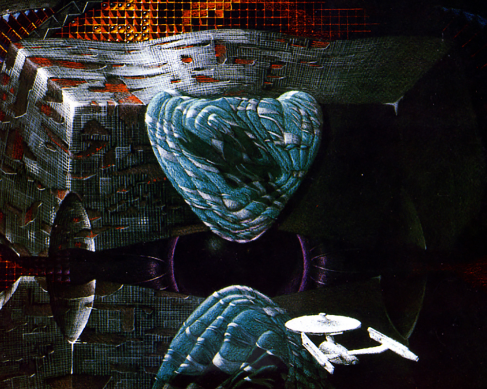
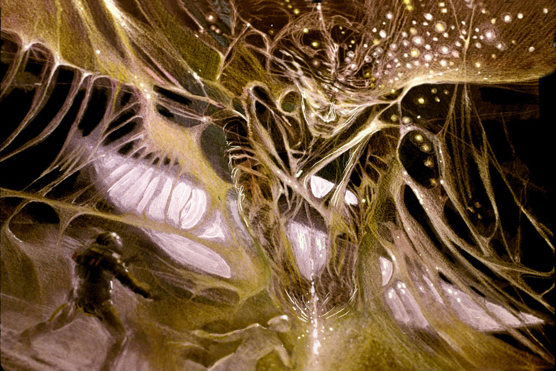
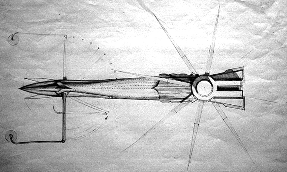
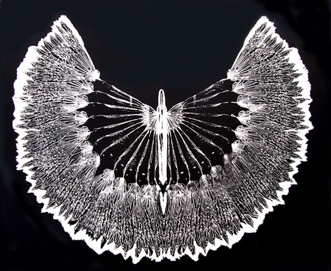
I have a really great collection of V’Ger drawings and other conceptual work that was done by David Negron, Tony Smith and myself
Tony was an artist I brought in to help with the conceptual design. Tony is a good friend of mine and is a fabulous painter. He can paint photo-realistically and has a great imagination. I did the original drawings of the exterior of V’Ger. I designed it with the idea that you would not ever see the entire object.
Roddenberry and the committee wanted it to be massive in scale. The only way to see the entire thing would be from some incredible distance or silhouetted against a planet. It was to be a dark object, not some light-covered mother ship from Close Encounters. It’s always more mysterious to show less and leave it to the imagination. When the maw opened up, it really did not look like a “weird fish”. I think it’s a pretty sophisticated design.
There’s a part of V’Ger toward the tail section where there is a huge sphere that rotates and in the center of that sphere is the old Voyager 6 probe. Our V’Ger design is much more complex and much more mysterious. For one thing, it would have been a lot more interactive with the Enterprise .
Even though I highly respect the work of Syd Mead (the designer of V’Ger as seen in the released film), your version of V’Ger sounds very interesting as well.
Well, my whole philosophy on V’Ger was to make it a living machine. It would have “morphed” and on the inside the walls would have been iridescent and changed as the Enterprise moved past them. You would have seen images of the Enterprise along the walls, because it was being analyzed by V’Ger and there would have been parts of walls that would break apart like a flock of birds or a swarm of insects.
The swarms would go from one place to another and reassemble. You could think of the particles as digital energy or digital information. I wanted it to be a very metamorphical and very mysterious place.
For the exterior of the thing, one of the design concepts I had was to photo-etch thin metal plates, so that the outside surface would have multiple levels which would continually move creating different patterns. We found a material that you could apply like paint that when heated with warm air from a blower would change color. It had an irridescent color quality that I was looking for, like a beetles’ back or butterflies wings. I wanted V’Ger’s skin or surface to change color near the Enterprise as it moved over the surface. I wanted the image of the Enterprise to be left like glowing phosphor images along the walls of V’Ger.
I have recently read that the upcoming Director’s Cut DVD has a different V’Ger transformation scene at the end of the film than what was released in 1979. Can you tell me what the original plans for the evolution of V’Ger into a higher lifeform were?
What we had storyboarded was that the whole V’Ger craft unfolds and turns into this incredible object in space. That effect would have started where Kirk, Spock, McCoy and the Voyager 6 was and would have radiated outward from there through the ship. There would have been this change that goes through V’Ger’s interior and then to the outside, unfolding into a big flower kind of thing with all these radiating colors and such.
I think V’Ger more than anything was incredibly compromised because the effects had changed hands and they had to come up with their own solutions in a very short period of time. Doug was not going to use my solution, because that model had not been built. We had built test pieces and had done extensive tests of processes we were going to use when we finally began construction.
I was told Trumbull described the exterior as a “weird fish” (Cinefex Magazine). That’s a pretty subjective description… I don’t think many would agree. I have the drawings and one can make their own analogy. My point was that one would never really see the entire shape of V’Ger because the ship was so big… it really wasn’t that important. Just show glimpses of the exterior and let the audience’s imagination do the rest. The important design elements of V’Ger were the entrance, the interior and the Voyager site.
Part 3: Into the V’Ger maw
There are some images in the TOPPS Star Trek: The Motion Picture trading cards and elsewhere of the Enterprise model with some strange green glow FX and what appear to be cloud tank effects — none of which appeared in the final film. Are these stills from RA&A footage?
One of our staff was an expert at shooting liquid and cloud tank effects. Some of the effects inside V’Ger were going to involve tank elements that were shot with a small black Enterprise model that made the liquids animate around the shape of the ship.
When we were building the motion control cameras, we did test shots of some of the models that were under construction to test their lighting system. This shop was kind of a test lab for V’Ger effects, such as the V’Ger surface effects and other things we were going to do with tank footage for the cloud and effects that were inside V’Ger. So I thought that analysis and interaction with the Enterprise by V’Ger was one of the things that didn’t make it into the final film.
I thought that V’Ger was a living machine and if there was a spaceship inside of it, it would be challenging it, just the way any living thing reacts to an intrusion. V’Ger would create obstacles or tests for the Enterprise and that Spock and the crew would have to come up with clever ways to get through the challenges laid down by V’Ger.
I thought the way Doug reshot Spock’s spacewalk was entertaining and dramatic, but I thought the Spock model looked like a model. But, I thought Trumbull ‘s idea was good, dramatically.
The memory wall was something I designed from an idea that Tony Smith came up with. We wanted to do something with a “bit”, which would later come to be called a sensor bee. There wasn’t going to be just one, there would have been billions of them flowing through V’Ger. It would have been about the size of a ping-pong ball and be alive with energy patterns and light effects.
When we shot the memory wall scene, we used front-projection material on the bit. We designed a hi-intensity projector with animating colors and patterns that were attached to the camera to give the bits life in the wide shots. We tried to do as many things as we could in-camera. Sometimes that thing would be flying on a monofilament and Spock would grab it and look at it and it would take off and nest with a bunch of other bees and form an object and break up and form another object, etc.
Anyway, he and Kirk end up following one of these sensor bees to the memory wall and he mind melds with it. The mind meld proves to be quite powerful and sends Spock to sickbay — as in the version that was released.
This was one of the things we were trying to bring to the movie that in hindsight I wish we hadn’t tried to accomplish. The production was too disorganized and under time pressures and that makes complex in-camera FX difficult. To do that effects now would be a piece of cake, but at that time fixing it in post was not an option.
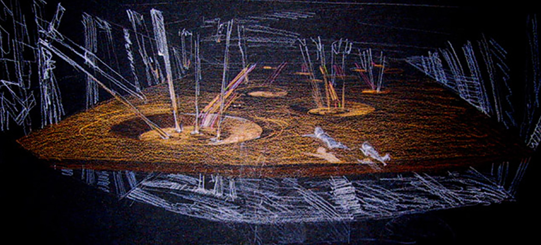
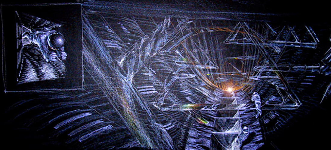
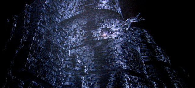
From what I have read, the memory wall stored the data patterns of the Klingon ships, the Epsilon Nine station, the planet of living machines, etc. — things V’Ger had encountered on it’s journey.
Exactly, and the memory wall had a rear projection screen built into it to display that practically, on set, as Kirk and Spock interacted with it. It was made of vacuum-formed plastic pieces — hundreds of them. Some of them were made with frosted plex and some of them from Stewart film screen that was vacuum formed, so that we could either shoot blue on it and composite V’Gers imagery later or rear-project it onto the set.
The main issue with this scene was “how do you fly people around through this scene?”
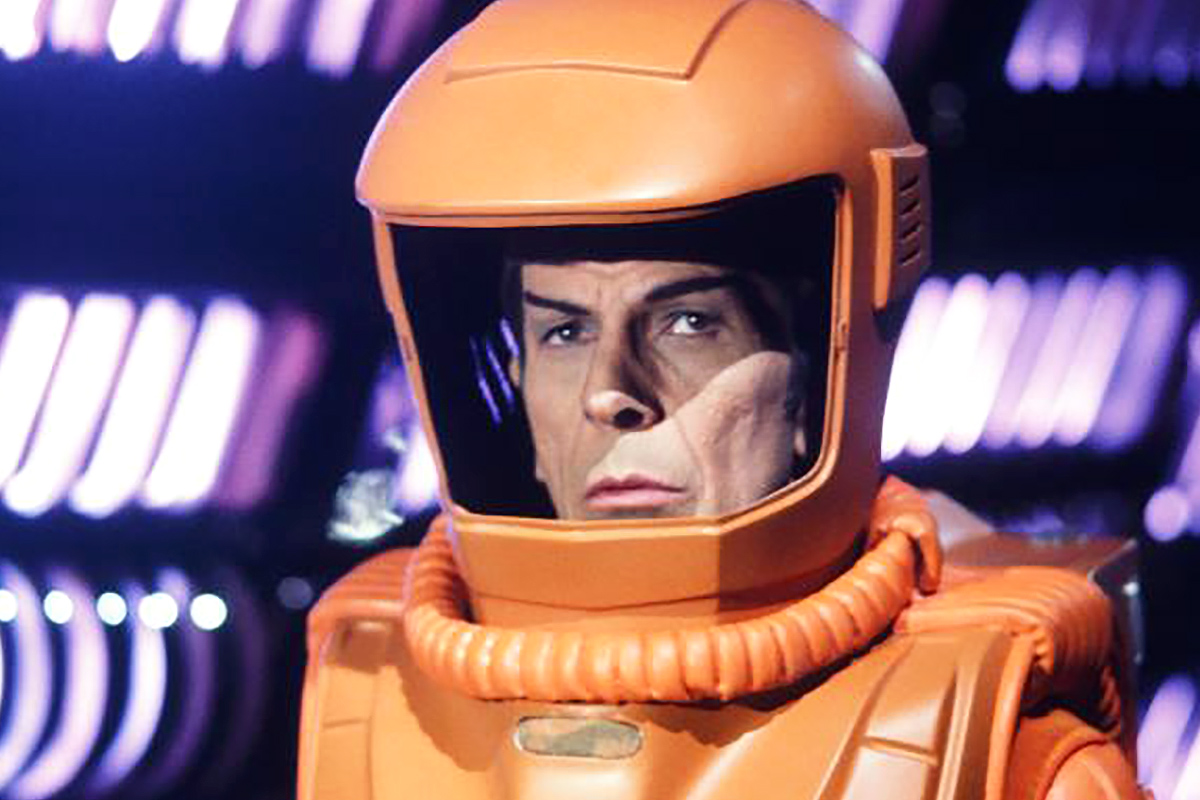
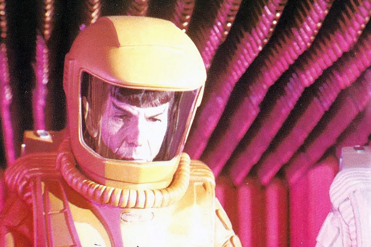
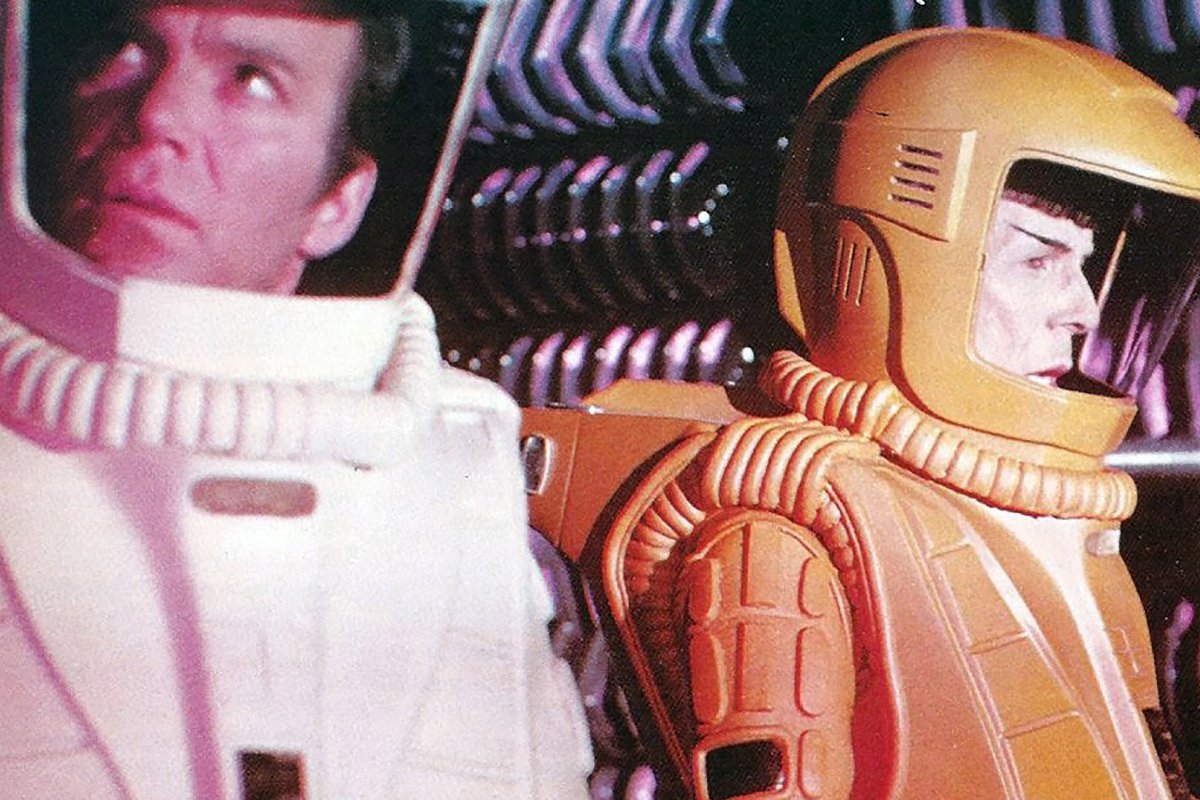
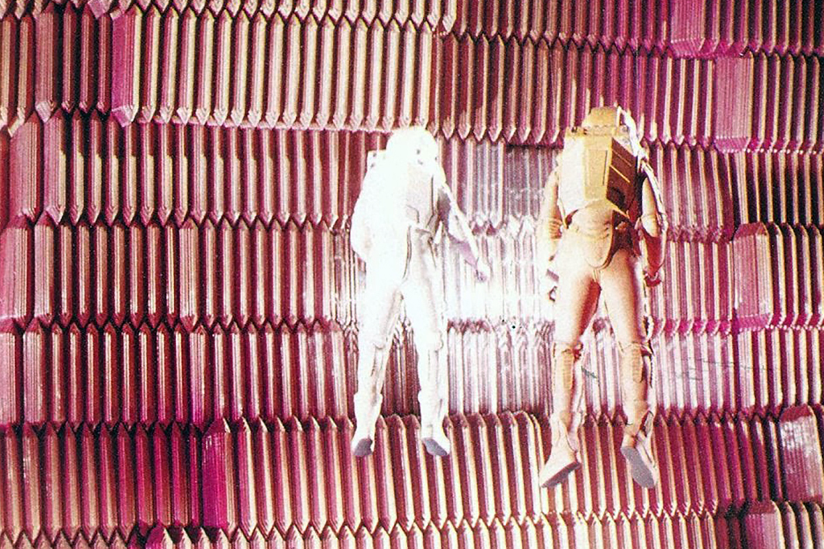
That’s the big criticism I have read about that scene — that it was ponderous; the spacesuits unconvincing…
The spacesuits were horrific! They were awful! We had nothing to do with their design. The costume designer (Robert Fletcher) had no science-fiction background; the spacesuits were an embarrassment, I mean had anyone in the costume design team seen 2001.
We got involved in how they were going to shoot those practical scenes when we should have just said, “That’s your problem”. But I got involved in how the interior of V’Ger worked and we were going to do the effects and guys from the studio and the Art Department were saying, “That’ll never work,” but at that time the only way people were doing any kind of weightless stuff was flying people on wires.
But anytime you see someone on wires you can tell they are on wires. The way one’s motions are limited. There are axes you can’t turn on and anyone who’s seen much film at all can tell immediately when someone’s on wires. Now you put someone in a spacesuit on wires and it’s even more apparent, because they are heavier and it’s much more difficult to move.
Then to build a track and trolley system above that can move in X,Y,Z — that’s an incredibly complex rig.
Then they wanted to fly two people up there (Kirk and Spock) at the same time. I don’t think the Cirque du Soleil could pull it off.
There were other ways they could have been shot from blue screen to front or rear projection, but the studio guys wanted to do it in-camera, so Robert Wise could direct them. Robert Wise wanted to fly them live on wires against these huge sets so that the effect would be done totally in-camera with no compositing whatsoever.
I was saying, “We should put them on armatures, like the weightless scenes in 2001. We can build an armature that goes through the blue screen mounted with a counter balance crane. Then we could move them up and down, rotate them and shoot the actors like models.” But Wise wanted to shoot this scenes as practically (in-camera) as he could. So the first time we got into that memory wall sequence he got frustrated and everyone got frustrated. The logistics were just nuts.
I am surprised that a director with Robert Wise’s experience and credentials would not have seen the potential pitfalls of this sequence and in shooting it the way it was shot.
I thought Robert Wise was a strange choice for director. Robert Wise was not a science-fiction person. He’s a wonderful man and a great director, but it wasn’t his cup of tea. I don’t think he enjoyed the experience very much.
He did do The Day The Earth Stood Still, arguably one of the best science-fiction films ever made.
True, but that was a different era and he was getting up in years by the time he did Star Trek: The Motion Picture.
I really respect Robert Wise, but this whole project seemed to overwhelm him. And I think he was just worn out by the politics, indecision and change. The film needed a clear vision and as I said earlier it was being created by committee.
Part 4: Designing a 23rd-century odyssey
What can you tell us about the design phase of the film, especially the ships and vehicles?
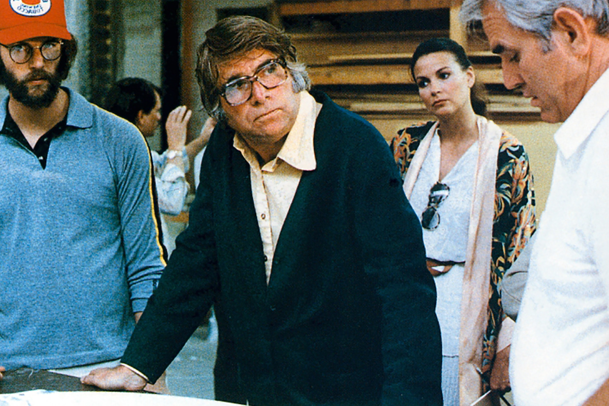
When I was designing any craft, I would sit down with the Art Department and go through the ideas and rough sketches. Different designers worked on different elements. I’d make a decision on which designs we would refine and we do final presentation drawings. Then would present these designs to a committee of ten to fifteen people.
The committee would consist of Robert Wise, Gene Roddenberry, Jeffrey Katzenberg, a NASA advisor, etc. I’d present, say, Workbee #1 and the discussions would break down into, “No, it wouldn’t do that because of this or that reason.” These discussions would go on and on — sometimes for a day or two per design.
I came to realize that the way to get the best design — the one I thought was best — was to put it about eight deep in the stack, because I knew if I showed them that one first it would be rejected. So I’d bury it in the stack and by the time they got to, say, number eight they’d say, “Yeah, that’s a good one, we like that!” because by then they were worn out.
There was nobody at Paramount working on Star Trek who had a creative vision, like a Lucas or Spielberg. They were all people who were theoretical experts and that’s a death sentence to a film as far as continuity goes.
It’s also what George Lucas and Steven Spielberg didn’t have to deal with. I don’t think Roddenberry had a vision for this film. Gene Roddenberry, I got along with, but I soon learned he had his own blind vision about everything, from how things looked at the speed of light to the size of the twelve feet in diameter doors on the Enterprise. I really think the most successful pieces on The Original Series were the one’s he had least to do with.
I agree. I’d credit Gene Coon and D.C. Fontana with creating Star Trek as we know it, more than anyone else.
Gene Roddenberry gets the credit, but I have to tell you a lot of other people did the dirty work. He was in charge, it was his baby, but it was also a kind of rudderless ship.
When we were designing and shooting the memory wall, we were getting spread too thin and Roddenberry was getting upset. Now, the original budget we were told we could work with was $8 million, but as the script changed we’d go back and say, “Ok, you’ve changed this so now we have to re-do all this so it’s going to take more time and money.” So the budget at Abel’s kept changing and going up as the script kept changing from week to week. Time is money in this business, like any other.
Now, had the script remained the same or just changed a little, we could have held to the budget. As they’d change the script we’d re-storyboard and re-storyboard and reconfigure our game plan on how to get the work done. I have four copies of the storyboard that are so different from each other you’d hardly believe it was the same movie. They contain every drawing that Ed Verreaux drew and I have to tell you storyboarding the Enterprise is incredibly hard, because it’s a complex object to draw. Just try doing a drawing of the Enterprise from a three-quarter view sometime and you’ll see what I mean. But Ed had to draw it thousands of times. He did a great job and I know for a fact that most of the boards we created for the movie other than the V’Ger sequence were used by Trumbull.
We were storyboarding constantly to keep up with the changing script. Then Robert Wise came on and we had to bring him up to speed and Roddenberry would keep changing his mind.
As a designer, as someone who understands mechanical things and how they work, I started doing all kinds of research on what would really be done to build structures in space; foil folding mechanisms and the technologies that were being developed at the time to build structures in space. The center of gravity of an object is critical with objects built for weightlessness. Well, the center of gravity of the Enterprise is outside itself. It is one of the most unbalanced objects ever created for space. It would be a real nightmare to actually maneuver the Enterprise in space. You’d have more gyros on board than in all the flying craft on Earth.


It could only exist in the realm of fantasy.
Exactly! But it was a mandate from Gene Roddenberry that the configuration of the Enterprise is similar to that of The Original Series; meaning that there be a saucer, the large dorsal, fuselage, two-struts at an angle and nacelles. So it needed to have a similar configuration, but not be exactly the same.
My approach was to kind of give it a stylization that was almost Art Deco. I spent weeks drawing and re-drawing the nacelles. I mean the front-end of the nacelles is almost a 1940 Ford grill. But I tried to make it have a very Art-Deco feel; for example I added the parallel lines along the edge of the saucer. Things became more elongated and more elegant than the television series version.
When we first came on the project, we had to look at everything that existed and Roddenberry said, “Just use the sets that we’re building and the models we are building.” So I gave the models and honest look, but had to tell them in the end that, “If you use these models and sets, you’re going to be laughed out of the theater.” The models would have been embarrassing at best. They were really old-school in their detail and were not built to armature and light the way we needed for motion control. They looked like the old television show.
Again, Don Loos built the Enterprise and Magicam built the drydock and a few other things, but they were building for a television movie. The resolution of television is forgiving; the big screen is not.
I sat down with Roddenberry and Katzenberg and said we are going to have to redesign the Enterprise, because it needs to be armatured from six sides and it needs to have lighting systems in it. I told them, “You saw Star Wars. You saw the quality of those models and for us to shoot these models of yours with motion control; to put that motion blur in there with multiple passes… it has to have lights that we can control for individual passes.”
If the camera is going to get close to the model — say, up close to the windows, the model has got to be big enough for us to give it detail. Trying to film a model that is too small is deadly. The focus, lighting, depth of field, surface textures and much more come into play.
The Enterprise ended up being almost twelve feet long. The model that was under construction was maybe four feet long.
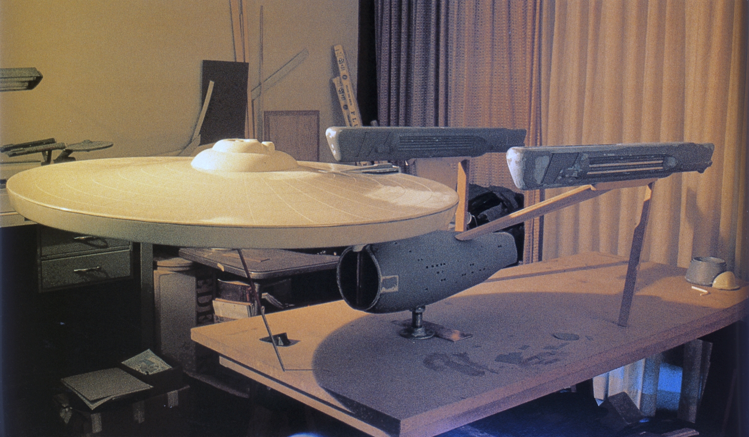
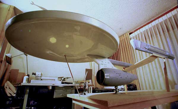
If the miniatures they wanted you to use were the ones pictured in the book, Star Trek: Phase II, I have to say I agree with you.
Well, I think those were the ones. I told them we were going to have to redesign them and the sets. Well, Joe Jennings, the art director at the time, and the team who had worked on the sets was not happy about that. There was resentment there. It was tough to tell them that the sets had to match the new models and therefore the sets needed to be redesigned as well. The sets needed to have a much more hi-tech look and they needed to have a lighting concept built into them.
Part of the battle that we went through was that Gene Roddenberry had his ideas about what these things should be. He’s one of the few people I’ve ever met that believed he knew what things looked like at the speed of light. I did research on it and got some film from MIT where they had done simulations of what things might look like at the speed of light. The fact is it’s pretty boring! In the end things have to look good and be entertaining. If you fly through a starfield at the speed of light, the stars do not go whizzing by you, they actually go away from you, they actually spread because the stars are so far apart they never go whizzing by you. So, this whole thing about going through a starfield with things coming by you in the Z-axis just looks good, but that isn’t what happens. But then, if you design everything from pure science or practicality it’s just boring.
When designing the vehicles and sets I wanted to show the Enterprise, workbees and drydock as an extension of the latest kind of real space construction technology that NASA is using today. Roddenberry, when he wanted to get involved in how we were planning to show the twenty-third century technology, would come in and just override it.
For example, he said the doors on the Enterprise are twelve feet in diameter and round. I said, “A round twelve-foot-in-diameter door? That’s just monstrous!”
Then he said we want this shuttle to dock with the Enterprise. And I said, “So you are telling me I have to design a shuttle with a twelve-foot-in-diameter door?” And he said, “Yes, I want these big grand doorways to open up onto the Enterprise.”
I said, “Can these doors iris open?”
“No, they can’t iris open.”
I said, “How can this little shuttle have a door that big and open it if doesn’t iris open?”
So I finally came up with a solution that the doors when docked with a station or other spacecraft open or slide into the walls of the adjoining craft.

That concept made its way into the final film.
Yes, well I designed that shuttle. The first shuttles that I designed were really cool, but it just turned uglier and uglier until it had what I call that “guppy” look, because Kirk had to fly around the drydock and “see his mistress” and you had to see Kirk and Scotty in the window while they are flying around; he had to have a big panoramic view, and it had to have a twelve-foot door at the back to dock with the Enterprise. It’s one ugly little spacecraft as far as I’m concerned.
The final design of the travel pod and other miniatures came from the Robert Abel and Associates Design Studio?
Oh yeah! All of the models built were almost entirely complete. Everything but V’Ger — and we were just beginning on V’Ger when Doug Trumbull took over. All of those models Andy Probert and myself designed. I drew the original blueprints myself and I had those blueprints before Andy came on at all. Then Andy came on and he worked on some more details and he made some suggestions and we went back and forth exchanging ideas.
And then Magicam, which was a division of Paramount, was already working on things, so it was a mandate that they would be the model shop for the film. Joe Motza ran that company and Jim Dow was the technical director of the model shop. We had to build up the model shop to deal with this project. They had to reorganize to be able to take on the project.
Magicam was the first model shop Mark Stetson (later of Digital Domain; SFX supervisor on The Fifth Element). Star Trek was Mark’s first project at Magicam. The group at Magicam were great, because they were really receptive to what I wanted to do and they wanted to make state-of-the-art models.
I had an art department that had several designers working on several parts of the film; Michael Sterling worked with us on all the graphics and alphabets, elements that remain in use today in the current Star Trek series and films.
Part 5: Designing the future
I had actually seen a photo of a Klingon ship (being worked on) that was in a magazine while Star Trek: The Motion Picture was in production, and this one was different from what appeared in the final film as it had plating on it that appeared to be painted on in various shades of blue. Was this the Klingon ship that your team designed and would have shot?
No, that was built before we got involved. I redesigned all the surface textures, the photon torpedo tube and many other details. I tried to put a kind of bird-feather design on the surface.
One of the things we did with all of the models was to give their surfaces details and interesting designs. A smooth object has no scale, so it’s important in model work to find ways of creating scale. Sometimes it’s very subtle, but it’s one of the most important elements in model photography.
We did re-build the Klingon ships and that was one of the first things we finished, actually.
Getting back to the Enterprise, I had this idea of giving the surface of the Enterprise a patterned, plated look and we made masks for the surface to create that surface effect. We did experiments with crescent metal powders and other iridescent and pearlescent paints. So in the end we made pearlescent body panels that varied from each other by minute differences in color and reflectivity. There were multiple masks that were used to give the surface the complex texture you see on the screen. The painting was phenomenal.
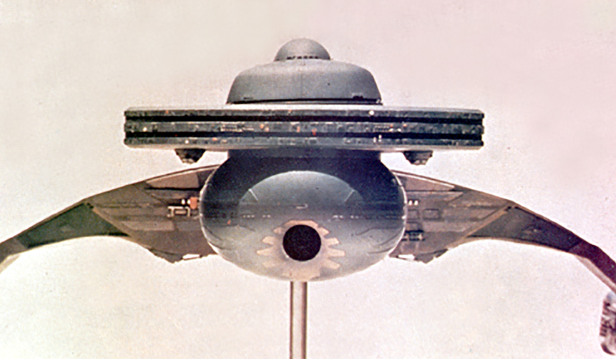
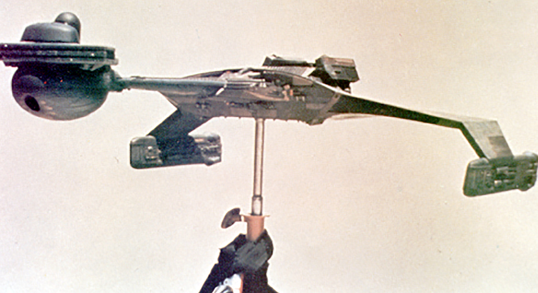
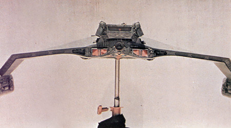
It is! And I can tell you as a hobby miniature builder that everyone who has built a model of the Star Trek: The Motion Picture Enterprise has had a hell of a time duplicating the look. It’s totally unique and actually very hard to match without careful study of the actual effects model.
Growing up, my father was an Air Force officer; a fighter pilot, so I grew up building models of airplanes, speedboats, racecars and the like. I still do build models, but not nearly as much anymore, but I do enjoy it. I was always involved in techno-design; cars and things that are functional, mechanical. But with the Enterprise for Star Trek: The Motion Picture, I designed it so that the saucer could jettison and that the ion engine that powered it was visible and was a cool design.
The bridge was designed so that the Vulcan shuttle could actually dock with it.
The Vulcan shuttle was also another model that Andy and I designed and was kind of a takeoff of a catamaran. We kept in mind its function in that part of it was going to have to detach from the warp sled and dock with the Enterprise. I had to design a shape that was going to be able to physically dock with the docking ring behind the bridge; so anything that had too much height wouldn’t work and again, according to Roddenberry, it had to have a twelve-foot-in-diameter door.
I got into the philosophy of how the Enterprise theoretically works. The Enterprise behaves somewhat like a surfboard that rides on a continuos wave created by the disturbance in space created by the antimatter in the nacelles. But again, the Enterprise’s center of gravity is outside its actual body, so I put maneuvering thrusters all over the craft, on the nacelles, the saucer, etc. Something I wanted to do was have an animation effect for the thrusters working when the ship is maneuvering out of the drydock.
I also assumed that at some point we might want the saucer to jettison — either in this film or another one — so we designed it so that the saucer could maneuver by itself and land if necessary.
So the Enterprise had lots of functions it had to accomplish in the movie. How things came in and out of the cargo bay and how they were moved and stored.
One of the things that was really a battle for me was the design of the drydock itself. You know, to make a big rectilinear thing in space made no sense to me. I wanted to make it hexagonal or circular and give it a center of gravity that worked well, it could orbit the Earth and we could have the whole thing rolling together. It would have been much more spectacular and would have had the feel of the space station in 2001.
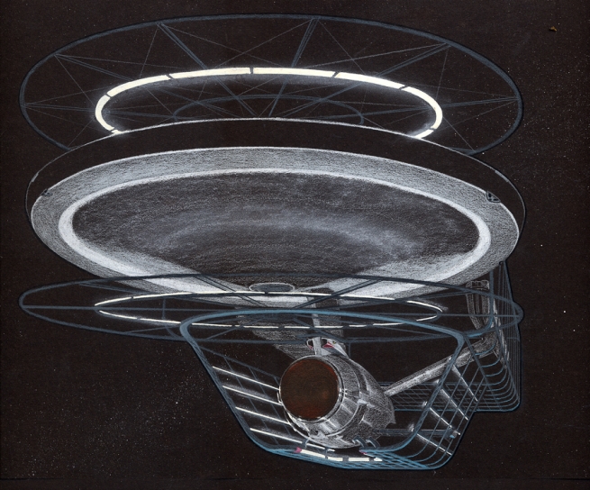
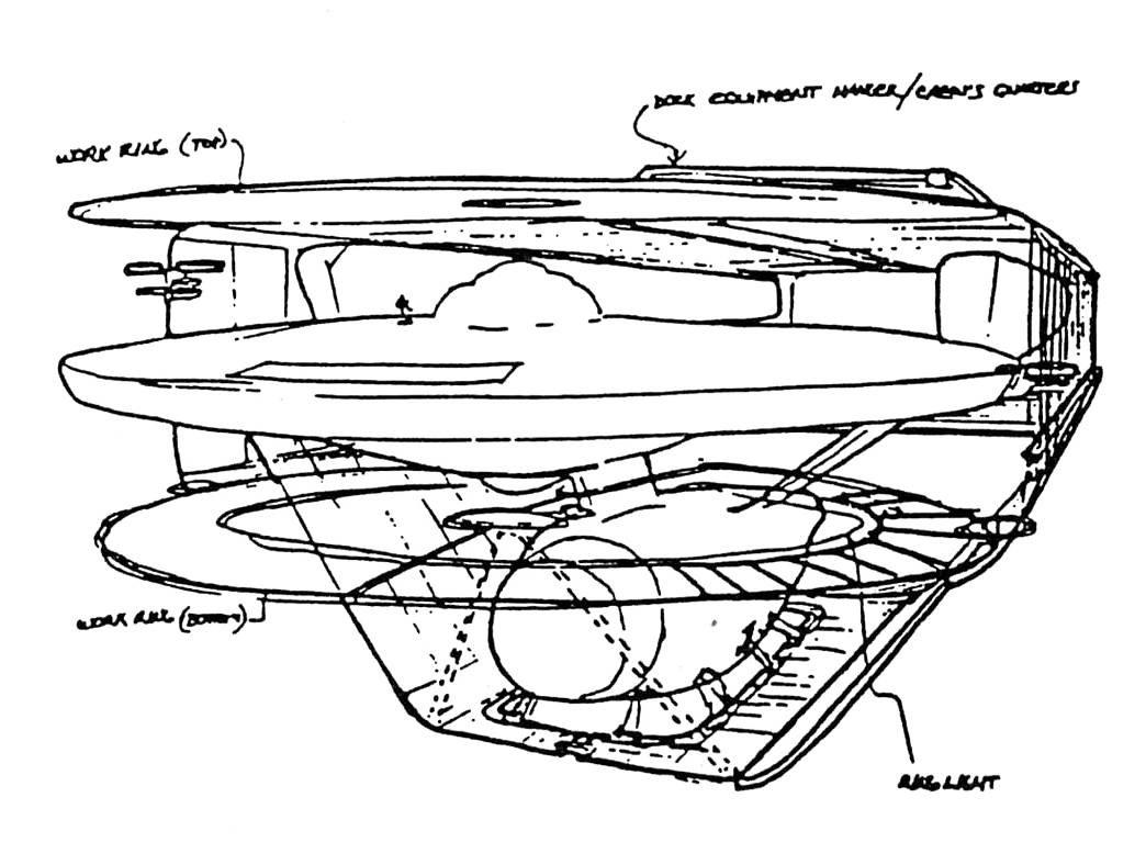
That really didn’t make sense to me either just watching the film for the first time — from the standpoint of scientific visual accuracy. Your concept seems like it would have given the viewer more of a “zero-g” feel.
The drydock could have been a phenomenal design, but Roddenberry insisted that it be rectangular. I wanted to create a dock that in cross-section would be hexagonal or circular. I wanted the same for the Enterprise when I first came on the project. I said, “Good, we’ll redesign it,” and I was thinking of something similar to what they came up with three or four movies later — a new, modern shape. But Roddenberry said, “No, it’s got to have that configuration, because that’s the signature configuration of Star Trek.”
The workbees and the Vulcan shuttle were cool. The space office complex turned out pretty good, but it wasn’t nearly as spectacular as I had hoped.
One thing that I knew we had to have a lot of design input into was the bridge and the engine room. I didn’t care what Kirk’s quarters looked like, but the engine room with all the fusion and antimatter? That’s got to be pretty amazing! Same for the bridge.
I got into this and one of the first things I did was tell Roddenberry and Wise (and this probably ruffled some feathers), “Look, I’ve watched the television series and I’ve noticed that every time there is an emergency everyone is falling out of their seats. Even airplanes have seatbelts. You’ve got to have seats that hold them in in some way.” So I convinced them to do the thing where the arms come down over your lap. I mean, here you are flipping around in this vehicle that is going through a wormhole and to have people falling around all over the bridge would have been stupid.
Well, in The Original Series, the chairs weren’t even secured to the floor and were basically chairs that could be found in furniture stores and whatnot back in the 60s, with some minor modifications.
I thought the chairs we designed could have been even more interesting and hold the person in even more.
Another thing is, around the bridge, at Spock’s station, etc., Roddenberry insisted that they have oval-shaped screens and if you know anything about design you know that’s one of the most inefficient shapes to put a lot of information on, because you are cutting the corners off the display area.
I also said, “I think the consoles should not have switches and knobs, they should be tactile touch screens. You touch the screen and the things change and arrays come up, etc.” I had been to Lawrence Livermore and had seen what was coming up down the road regarding tactile display design and Roddenberry wouldn’t go for any of that. He said, “You’ve got to have round screens or oval screens,” and the kind of graphics they ended up using on those screens were very hokey compared to what it could have been.
It was blinking lights and the kind of thing they make fun of now in Galaxy Quest and the like.
(laughs) Exactly! It was kind of strange swirly stuff and blinky stuff… It isn’t that what we wanted to do wouldn’t have been entertaining or interesting. It would have been really interesting and entertaining — and a lot more graphic.
Chris Ross, Andy Probert and my team were designing hand props; communicators, phaser, typeface, logos, all kinds of things and it all had to have continuity. On the bridge they had the viewscreen and that worked out OK, but I wanted to have another kind of celestial sphere space navigation device that came down out of the ceiling with concentric spheres of stars, but they nixed that.
They did have a navigation dome in the ceiling.
I convinced them to do that, because to have that detailed ceiling and with the circular design you needed to have that dome up there.
I know at one point there was going to be a transporter pad on the bridge. Can you tell us about that?
There was an idea of putting a transporter on the bridge, but I convinced them otherwise, because why would you need to have Spock dock with the ship if you had a transporter on the bridge? Then I said, “Well if you put that on the bridge you might as well put everything on the bridge.” So they backed off of that.
One of the things I did with the Enterprise was design windows that go around the exterior of the saucer that do not just have light coming out but used small transparent images of the sets inside the windows, so that when the camera got close to the model it appeared that you could see something in the windows. By the way, in some of those windows you can see photos of Mickey Mouse, Andy Probert and others as a kind of in-joke.
Part 6: Exploring strange new techniques
One of Andy Probert’s illustrations shows a depiction of the officer’s lounge looking through the windows. You can see the Enterprise‘s engines and an energy effect between the engines. What can you tell us about the plans for this effect?
I designed the nacelles to have an effect added and to have light panels built into them. I wanted to have an effect that radiates from the glowing panels on the nacelles; something you could see. A distortion with a light effect as well. We would have had that streak when the ship is in motion. Of course, that never happened, but probably would have if we had finished the film.
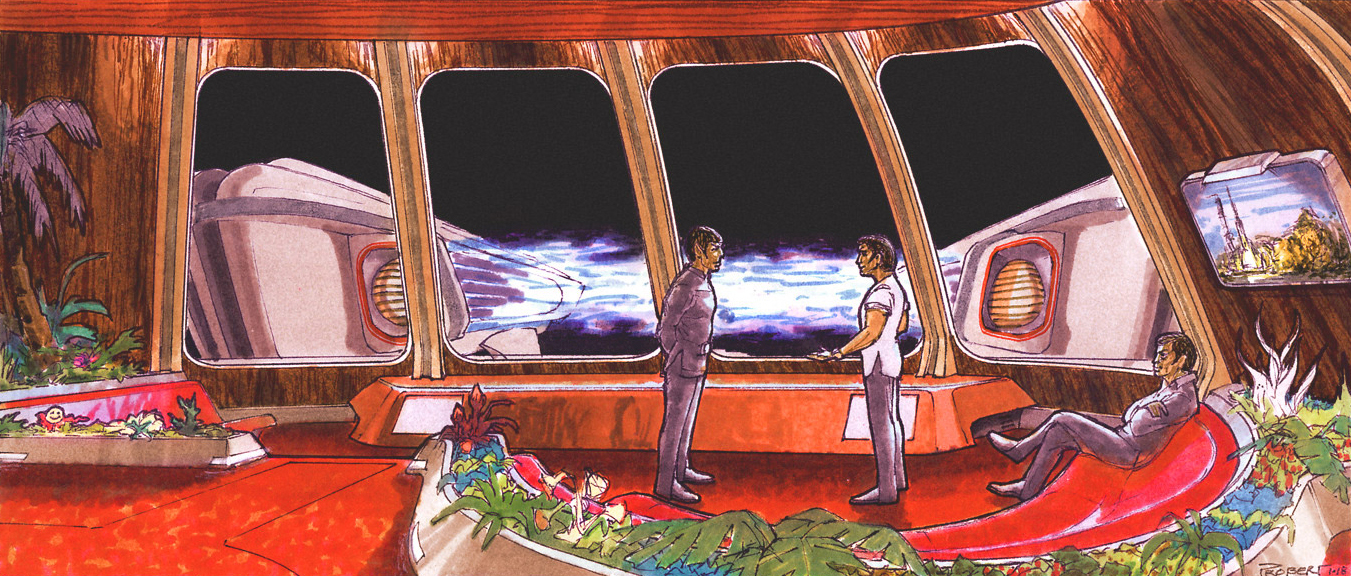
What was planned for the actual warp drive effect? Was this going to be a slit-scan effect similar to what was in the film as released?
I had always had the idea of the Enterprise going through this incredible Z-axis color change; the stars and everything needed to break into the spectrum to become streaks of color. So there was another idea and it was a really quick abridged version where it just kind of goes bam! and that was just a trick filter effect. But yes, we were going to do a streak effect for warp speed.
Another effect that would have been phenomenal was the energy probe that comes onboard the bridge. Stuart Ziff (developed GoMotion, the process for animating the dragon in the 1981 film Dragonslayer) developed the really bright light source used on the bridge during this sequence that could be moved around. This was incredibly bright and was actually kind of dangerous.
We built a strobe tube that was roughly four-and-a-half to five feet long that had a strobe tube that ran off a capacitor that was literally a semi-truck capacitor out on the lot. A man wearing a black suit carried this strobe. The light itself was hooked to a computer so that we could change the intensity and the pulsing of the light. It was a phenomenal, phenomenal thing. It was so powerful. It was really scary, because it was crackling with power. We shot all of those scenes before we left the project.
What I wanted to do was animate over the light — which is what Apogee did. But what Apogee did was a Mylar trick of distorting Mylar and shaping it, and it really just ended up being white light. But what we were going to do is — and I had done tests with this — is build an armature of wire and bending it, painted white with S-curves connected to a rotating base. If you spin that you get an oscillating effect and with light projected on it, with streak exposures and it gives you spiraling shapes. Then you’d do five passes with different shapes nested inside themselves. It would have been cool!

It is more interesting, visually, than what was in the final film.
After the project left Abel’s, the momentum we had going was stopped because they had to move all the equipment and some of our personnel and divide it up between Trumbull and John Dykstra. They were running 24 hours a day, because they were running out of time because they killed the momentum we had. They had to take the models and figure out how they worked, etc.
Trumbull had worked at Magicam before and he knew those people over there. While we were building the models, he used to drop by and check them out. I knew he thought they were pretty cool. He was very complimentary and said, “Wow! That Enterprise is incredible!”
Anyway, that momentum shift of handing everything off to Trumbull and Dykstra created lots of things that got done in just any way they could get it done — such as the energy probe. Basically, they said, “We’ve got to add something over that practical lighting,” and they went with what worked and what could be accomplished quickly with the time they had.

Who were you planning on using to complete the various matte paintings for the film?
I think I was going to use Illusion Arts.
Is there anything else you can tell us about the making of Star Trek: The Motion Picture that our readers might find interesting?
I’ll tell you another little bit, it was one of the things that just drove me crazy!
On Lieutenant Illia’s neck there was a glowing thing on her neck that was a practical effect. We used tiny hairline wires that went around her neck and were colored the color of her skin and connected to a tiny battery pack on her back. Those wires would break all the time. The lights for the thing on her neck were tiny grain of wheat bulbs and the batteries would last three takes and then go dead and we’d have to change them — all this just to have the glowing thing on her neck. It was one of those things where I wanted to say, “Fuck this stupid little light on her neck… it’s not that important to the story, it’s not really adding anything significant.”
But that’s what happens in filmmaking a lot. Someone gets carried away with some minute detail that’s really not that important while some bigger things that are really important get overlooked. We could have rotoscoped it in there and burned it in, but that’s another optical pass and you have to track someone moving around, etc. I suggested they make it a kind of necklace, but no, it had to be this thing embedded in her skin and it had to be practical.
What were your feelings when your tenure on the film ended?
It was the first feature I was involved in and it was disappointing when the plug was pulled and there was a lot of politics involved, which I won’t get into. In a sense I was relieved, because it was such a reactionistic out-of-control way to make a movie.
What is really discouraging is that for all the design and creativity that was put into it, it was all just swept under the rug and yet the general public assumes that the majority of what they saw on the screen was created by the Trumbull group. The fact is we had done most of the preliminary design work and had solved lots of complex production and design problems. We had created an awesome car and they pretty much just needed to put in the key and drive away. Robert Abel and Associates, Andy Probert and everyone else deserves credit for their work on the film and the Star Trek legacy.
It would have been fun to see how our approach would have turned out. It would have been fun to finish something we started, but Hollywood has its own momentum which sometimes we cannot control.
The movie was budgeted (effects budget) at $8 million when we first got involved but had escalated to $12 million with all the changes that were being thrown at us. Some said the project was out of control. By taking the project out of our hands, it escalated to $20 million.
Thank you very much for your time, retrospective and incredible conceptual art from your tenure on Star Trek: The Motion Picture! This is an invaluable archive of artwork and will be of tremendous interest to admirers of this film and visual effects in general.
I consented to this interview in hopes that the Abel Studios and all the talented folks who worked there might receive at least some small recognition for the work they created for the film. We did a large amount of phenomenal design work and when the film was released, I, Richard Taylor received the last and only credit in the movie. It simply said RAA designs… Richard Taylor. I couldn’t believe it.
So, hopefully some of the people who created so much of the Star Trek legacy can be appreciated and receive some of the credit they deserve.
Your team was undeniably talented as evidenced by the former employees of RA&A who went on to achieve true greatness. People like Andy Probert, Ed Verreaux, yourself and many others. Thank you for your time, generousity and helping me to finally get the Robert Abel and Associates’ side of the Star Trek: The Motion Picture story out to the public!
