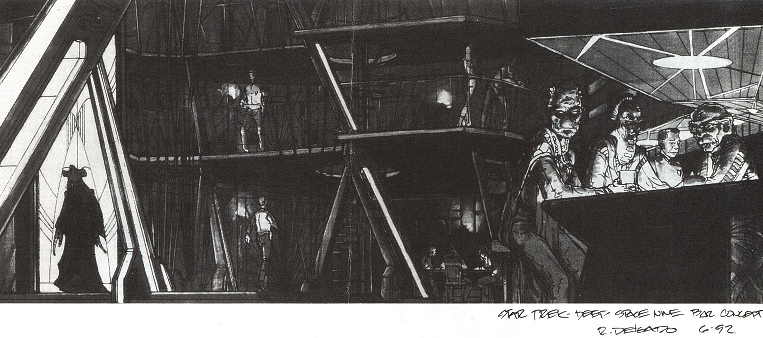
Inside Deep Space Nine
Production Designer Herman Zimmerman’s starting point for the interior of Deep Space Nine was the Cardassian style of Star Trek: The Next Generation. But this didn’t give him much to work with. No inside of a Cardassian starship had been seen. So Zimmerman looked for inspiration to Robert Blackman’s Cardassian costume designs; an armored look, somewhat crustacean in appearance.
The theory was that the Cardassians were big on structure and if Cardassians felt structure was of vital importance, they would keep it on the outside. Zimmerman visualised a space station of which the basic framework was not concealed, but where all supports and structures were visible.
“The Cardassian mind prefers balance to symmetry, ellipses to circles, angles to straight lines and hard metallic surfaces and dark colors,” Zimmerman said. “They don’t like ninety-degree angles.”
Cardassians believe in honesty in design and want to see the columns and beams that make up a structure rather than disguising them with some cosmetic treatment.
Working with that basic concept in mind, Nathan Cowley and Joe Hodges melded the desired crustacean look with the heavy-handed impressiveness of fascist architecture for the show’s sets. As realized, the sets were imposing but unique: a truly alien sort of streamlining.


Given the Cardassians’ militaristic nature, Zimmerman designed their Operations Center in such a way that the commanding officer can look down on it and see everything that is going on. There are literally windows everywhere in the office, so the commander would have no blind spots.
Another part of Zimmerman’s design concept was that the sets and devices on the Cardassian-made station were not as user-friendly as those of the Enterprise. Notable are the automatic doors on Deep Space Nine: large, round and cog-wheeled, they roll nosily out of the way and then roll ominously shut. Whereas you would never imagine the smooth, almost soundless doors of a Starfleet vessel to close on you, it seems likely that Cardassian safety features were less rigorous…

Another artist who contributed heavily to the look of Deep Space Nine was Ricardo Delgado, an illustrator who designed and storyboarded the opening title sequence for the series and designed many of the essential but unobstructive background details of the sets. Much of the Promenade was Delgado’s creation, from its alien plants to its exotic shops.


The Promenade underwent a heavy facelift after the show’s first season. “We wanted more bustle,” said Rick Berman. “We had all these well-dressed Bajoran women browsing around the station as if they beamed up for a little afternoon shopping.” For Season 2, they made “it look more like the part of town where sailors hang out; less like Beverly Center and more like a remote outpost in space.”
The Promenade, Quark’s bar and other adjacent sets were erected on Paramount’s Stage 17. It was one of the most elaborate sets ever built for television.

