Redesigning Starfleet’s Uniforms for Star Trek II

Few of the people involved in the production of the second Star Trek motion picture were happy with the uniforms Robert Fletcher had designed for the first.

“I don’t blame them,” Fletcher told Star Trek: The Magazine years later. “I didn’t like them much myself!”

Robert Fletcher
Robert Fletcher

The costumes seemed to sum up everything that was disappointing about the film: they lacked color and drama. They were bland.

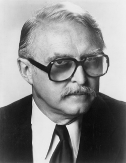
Fletcher, who had been brought in on The Motion Picture to redesign the uniforms William Ware Theiss had designed for the original television series, was asked to redesign them again. Except this time, there would be less budget.

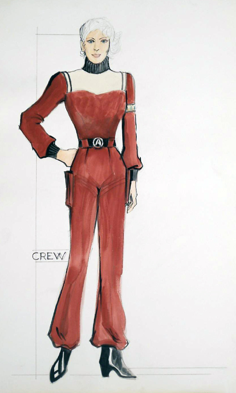
Fletcher and Producer Robert Sallin decided to salvage what they could from the costumes that had been created for The Motion Picture by changing the tailoring and colors. A series of dye tests revealed that the old uniforms could take three colors well: a blue grey, a gold and a dark red. The plan was to use these modified uniforms for the non-commissioned crew and cadets while enough money was found to design an altogether new wardrobe for the main characters.

Hornblower in space

When Nicholas Meyer joined the production as director, he had specific ideas about what he wanted to see in the new costumes.

I decided that this was going to be Hornblower in outer space, so I said, “OK, if this is going to be the navy, let’s hem them look like the navy; they shouldn’t be walking around in pyjamas,” which seemed to me to be what the uniforms in the first movie and the TV show looked like.

Prisoner of Zenda
Scene from the 1937 movie Prisoner of Zenda

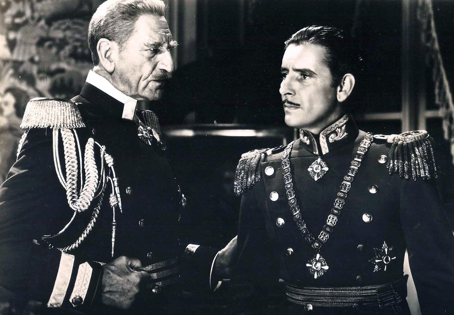
Meyer gave Fletcher one more instruction: he wanted the new uniforms to pay homage to the costumes worn in The Prisoner of Zenda (1937).

Fletcher began his work by producing a series of quick sketches. “I’ve always been used to an almost automatic drawing method,” he explained.

I scribble a lot and out of the scribbles comes the idea. Then I link that visual I’ve found for myself with other things intellectually and produce a scheme.

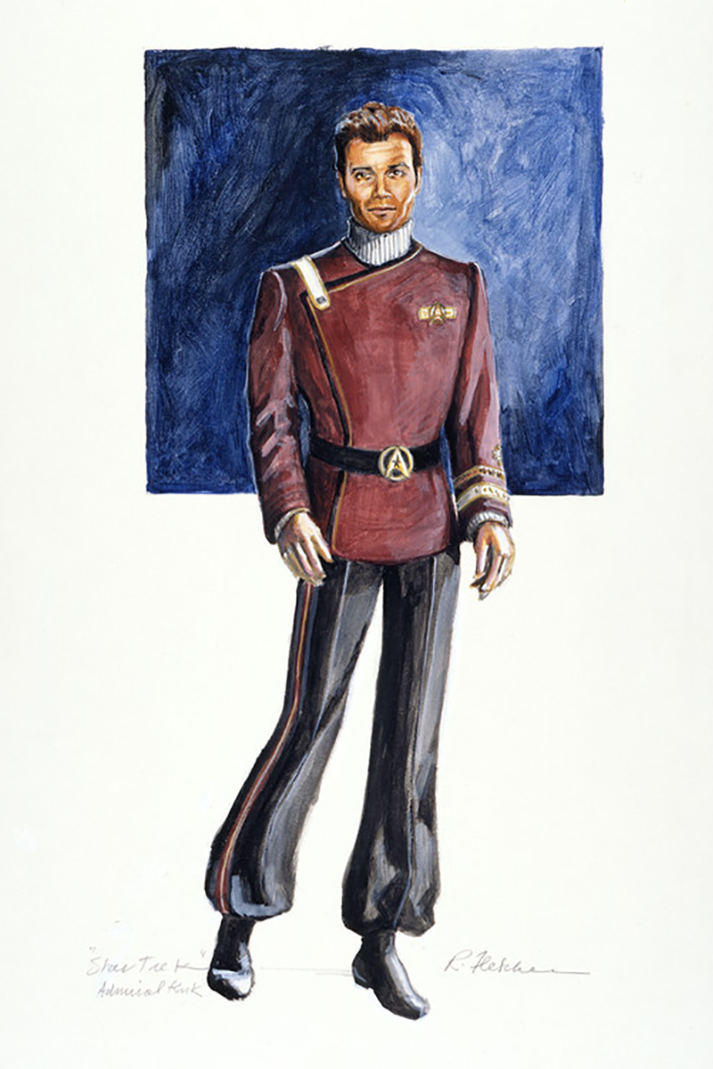
Fletcher was careful not to reproduce existing naval uniforms and used the dark red color that had been discovered during the dye tests. Meyer liked this approach, since it made the costumes dramatic and created a strong contrast with the background.

The first version of the uniform had a stiff black collar like the costumes in Prisoner of Zenda. Bob Sallin suggested changing this to a turtleneck. When he made the alternations, Fletcher decided to use trapunto, which is a form of vertical quilting.

Military uniforms

The new uniforms looked far more like military outfits than the ones from the first movie, which Fletcher conceded in an interview with Cinefantastique defied the Star Trek tradition.

Starfleet insignia and ranks design
Insignia and ranks by Robert Fletcher (Houghton Library)

“[Gene] Roddenberry always contended that the Federation is not a military organization. Yet they always behaved as if it were,” he argued. “They have ranks, they have military courtesy and Kirk is definitely in command on his ship.”

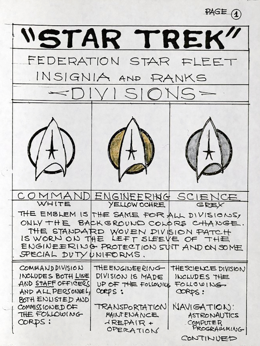
Meyer preferred the military look and asked Fletcher to design rank insignia to make the uniforms look even more like uniforms.

There was kind of a complicated arrangement of divisions and ranks expressed by the braid on the sleeves. I made that up. I organized it and produced a little instruction booklet about it for the wardrobe department and anyone else who was interested.

Initially, the insignia were worn on a band around the upper arm. This was moved to the cuff.

Flaps

William Shatner
Publicity photo of William Shatner

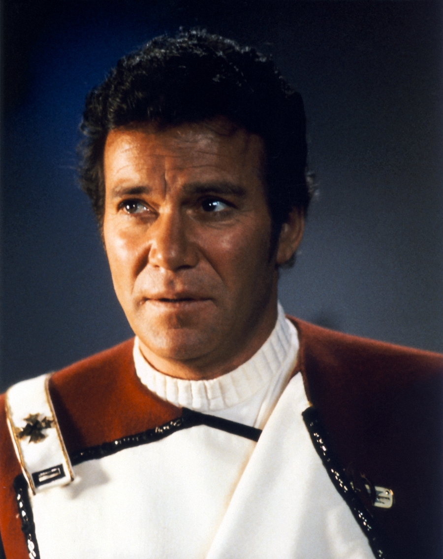
The last major change was to redesign the flap of the double-breasted jacket so it could actually open. This was something Meyer requested. He felt the lighter color on the inside of the flap would frame the actors’ faces better.

However, the flaps presented Robert Fletcher with a problem. When it was open, one could clearly see the snaps that held it in place — and these looked distinctly unfuturistic.

In order to make it look less like plain old snaps, I found this sterling silver chain that looked strange. I ordered a reel of it and sewed it in with the snaps to give it a feeling that it was perhaps a magnetic closing.

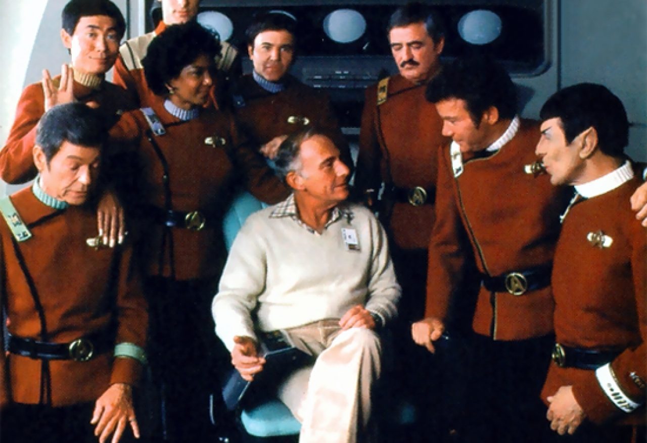
Fletcher then designed several variations of the uniform, most of which were worn by Kirk and not by the other characters.

It’s normal in any kind of military organization that you don’t have just one uniform; you have uniforms for specific tasks and specific times of day — formal, informal, combat, and so on. Kirk is the lead, so he goes through the most variations. When it seemed appropriate, he had a change.

Robert Fletcher’s new Starfleet uniform remained in use until the original cast retired, becoming as much a part of the Star Trek universe as William Ware Theiss’ originals.

Harve Bennett
Harve Bennett and the Star Trek II cast (Trekcore)

30 comments

Gawd, I HATED the Star Trek II uniforms. So bulky and uncomfortable-looking. And I can only imagine how ridiculously hot they must have been under the stage lights — like wearing a fur-lined parka.

Rolf Hawkins (Apr 26, 2016)

I liked them. They provided a real world feel to the whole picture. I think they looked somewhat comfortable, granted it must’ve been hot under those studio lights. They look no more bulky than a suit jacket.

My only quibble is that they should’ve kept the division colors from The Original Series to provide a greater sense of continuity.

Jaren Walker (Jun 28, 2016)

I agree with Jaren, completely.

Derek Udzbinac (Jul 24, 2016)

I don’t agree with the different colors for the organization. Starfleet is supposed to be inclusive and not a segregate organization. Offering different colors for bands or depts is fine, but The Wrath of Khan uniforms were the first time an organization had a uniform. A set attire that included everyone in one cause. The military has that uniformity and so NASA, a civilian organization the organization Starfleet is suppose to be mimicking. To have lavish colors and different varieties was a product of the 60s, nothing more.

Chris Hvizdak (Apr 13, 2019)

Erm… Chris… those were *all* uniforms.

If you look at military forces, they all have different uniforms within themselves, with different ones for different purposes.

The whole “ermagerd, colors aren’t uniform!” argument is nonsensical. You need only look at the flight decks of aircraft carriers to see the various colored shirts and uniforms in use there, with each denoting a different function.

These illustrate and explain the different colors and functions: link 1, link 2.

GIF (Mar 18, 2021)

I think they sort of kept the division colors, on the shoulder strap and the arm band. I think they were a vast improvement over The Motion Picture.

Robert Merkamp (Jul 25, 2016)

Could not disagree more. Terrible design. The only thing I didn’t enjoy in that film at all.

Rolf Hawkins (Aug 9, 2016)

You must be a product of the peace and love era… the Star Trek II uniforms were most likely hot as hell, but the didn’t look like actors wearing PJ’s on screen. Those uniforms were the best of all TV and movies put together…

Robin (Jun 17, 2017)

Another distinguishing feature seems to be the sweaters under the uniform jackets. For example, command officers wear white sweaters and medical personnel wear green. And so on.

Petoschka (Dec 19, 2021)

These uniforms were absolutely brilliant and evokes a sense of nautical regality missing in TOS and TMP. Fabulous Star Trek design sense with a nod to ‘cavalry bib’ tunics, bloused ‘paratrooper’ trousers and British full dress colorations combine to make the most powerful, memorable and distinct Star Trek uniform of all iterations; class, swagger, and dash. The perfect uniform for the command crew of the Enterprise and Starfleet!

Ron Lamm (Sep 1, 2016)

I hated the redesigned uniforms for Star Trek II and beyond. In the 1968 book The Making of Star Trek, Gene Roddenberry is quoted as saying that clothes (uniforms) in the future would not have zippers, buttons, clips, belts and many of what was ultimately in the design of the “red” uniforms. I wasn’t troubled by the uniforms in The Motion Picture except that they lacked color. In fact, I prefer the original uniform design by William Theiss of the first two seasons of TNG over the Robert Blackman redesigned uniforms for TNG’s remaining seasons.

IMHO, William Theiss was a far superior costume designer than Robert Blackman. The actors never liked them, because of their one-piece design, but they were tight-fitting to the actors’ body, and were not as “baggy” as the Blackman TNG redesign.

Just look at what jumpsuit the Space Shuttle astronauts wore from the fifth shuttle flight to the flight of Challenger’s destruction. Blue coveralls (seemed like one piece) uniforms with just a open helmet with an emergency air pack. After the Challenger accident NASA went back to using ungainly pressurized space suits, but in the end those wouldn’t have saved the astronauts in the event of another Challenger-type disaster, nor the demise of shuttle Columbia.

Fred Mushel (May 10, 2017)

There’s a reason why the actors of TNG preferred the later uniforms, and that was because to create the effect of no wrinkles, the actors would wear costumes that were too small for them, and so the new uniforms were designed, otherwise they’d lose Patrick Stewart because he was having back problems. Same reason why TOS actors preferred the TWOK uniforms over TMP. Gene Roddenberry was trying to create a futuristic look, but the problem with his vision of clothing was that he had no idea that functional clothing evolved based on comfort.

Matt Trinh (May 31, 2017)

I have always hated the ST:WOK uniforms. For all of reasons stated above. The closest thing they’ve come to a merging of the styles was DS9’s uniforms. Which worked for practicality. You’re not gonna sit for eight hours in a ST:WOK uniform without skin chaffing and massively sweating. Not to mention how stiff they’d be in trying to reach across consoles. They were horrible.

Edward Sanford (May 28, 2017)

I actually liked the design of the TMP uniforms. They were practical and in reality, one can imagine they would have been quick to don and doff. Essential for a duty uniform. Fletcher muted the colors as it was felt the bright colors from the series would have looked comical on the big screen. The idea of the utility jacket with large pockets for away missions made sense, as did Scotty’s onesie with the large thigh pockets for engineering.

When you look at the TMP design as a progression of the TOS uniforms it seems logical (pun intentional). The Star Trek II designs are a complete departure to the design aesthetic.

They did a lot of weird retrofitting in Star Trek II; notably the communicators and phasers. In TMP, the communicator was compact and wrist-worn, and the phaser was very streamlined. The communicator that Kirk uses in the Genesis Cave scene looks like the clunky version from “The Menagerie/Cage”.

Bruce Moffatt (May 29, 2017)

You are right on the communicator, but I would say in some ways it looked even clunkier than “The Cage” one (but at least it wasn’t transparent!)

The phasers from TWOK were actually the same as TMP though, you can briefly see security with them on the bridge during the V’Ger attack and there are behind-the-scenes photo with either Nimoy or Shatner holding one while wearing a space suit.

Chris (May 30, 2017)

What was wrong with the original idea? Lime Green (Command and Operations) Blue (Science and Medical) Red Engineering and Security) made Star Trek unique!

This is Trek’s TRADEMARK! It’s DIFFERENT! From Battlestar Galactica and any other sci-fi series.

The other sci-fi shows generally use a ‘military’ style idea, which Gene Roddenberry was insisting that the Federation is not a military organisation.

So, what was/is wrong with the original three colors? Simple, and practical, non-belligerent and iconic for Star Trek. If it ain’t broken, don’t fix it.

For me, it was such a relief when the three colors were brought back for the film reboots, it proves that it works for the big screen as well as the small.

I hope that the original creation will prevail!

Michael Nakonecznyj (May 29, 2017)

As a chef, I loved the new uniforms with the flap that could be undone for more casual times. The decision was far better than TMP.

Robert Makuch (May 29, 2017)

Has always been one of my favorite uniforms. As to the comfort, they seem no more or less comfortable than a chef’s coat, and they work in hot, greasy, humid, kitchens for 10 hours. I doubt the 100 percent climate- and humidity-controlled environment of a starship would be an issue, and future fabrics would behave differently. (“It is very *cold* in space!”)

I think in reality even the senior officers would more frequently wear what the extras wore, the jackets tend to lend an air of dress uniform to it that seems unnecessary for routine operations or training operations. Real world budget restraints aside, there should be a casual variant much like Kirk’s green wraparound tunic he wore in TOS.

Constantinos Kolios (May 29, 2017)

I love the Wrath of Khan unis! Kirk looked like a freakin’ doctor in that white monstrosity from TMP!

David Wilson (May 30, 2017)

Unless I am mistaken, the jackets were for officer uniforms only. I saw it as a means of identification among the crew, same as the rank insignia. Higher ranking officers usually have more “ornate” uniforms, do they not?

Jon Marvin (May 31, 2017)

Check out the extra standing behind Ms Nichols in the candid photo. He is like “Guy” from Galaxy Quest… look its crewman #6. I would have done the same thing.

I personally loved these uniforms. I bought the pattern back in the late 80s and had a friend who is a seamstress make it for me.

Kevin (Feb 22, 2018)

The best Trek uniforms of all time.

I loved how they gave them a shout out in some TNG episodes (minus the turtleneck shirt.)

Ricochet (Mar 28, 2018)

The Wrath of Khan uniforms lasted for the longest time, the 2280s until after Picard graduated from Starfleet Academy, the crew of Enterprise-C wore them minus the turtleneck as well.

They blew the TMP uniforms out of the water, ever see one at a con? NO ONE likes the TMP uniforms.

Kirk’s bomber jacket, the Regula I field jacket, I still want both AND a The Wrath of Khan uniform, but then I want a TOS dress tunic/pants and an Enterprise uniform too.

We can dream right?

Anthony (Jul 9, 2018)

Those are exactly the uniforms I want myself.

A.J. (Oct 14, 2019)

Jumpsuit onesies actually cut right into the privates. That’s the reason the actors complained and they were forced to change them to pants and a shirt on both the movies and TNG. The original Stormtroopers’ armors were hard plastic and had the same issue, their newer suits are soft rubbery stuff.

Zan Jayna (Jan 16, 2019)

Best Star Trek uniforms to date!

Mark (Mar 3, 2019)

I LOVE the TWOK (and beyond) uniforms. I understand and even agree that they seem like a step backward with regard to ease of wearing, taking them off and putting them on, etc. But WOW, do they ever look SHARP! I love the separate colors on the undershirt, sleeve band and shoulder strap denoting division, as well as the cool insigna designating rank. And the red “mountie” jacket with the flap is beautiful. Further, the field jacket, Scotty’s engineering vest, and officer’s bomber’s jacket expanded the fleshed out the look very nicely.

Do they look futuristic and efficient? No. But do they look gorgeous on screen? Oh, hell yeah! I understand others’ objections to them, and to be fair those are quite valid reasons. But all art is subjective, and me, personally, I just adore the aesthetic of these uniforms most out of all iterations of Star Trek.

It’s funny: I don’t recall where I read or heard this, but George Takei once said that, during the filming of one of the movies, he found it uncomfortably hot to wear the uniform under the lights needed for shooting. But since Sulu spends most of his time on the bridge, in shots only featuring him at the helm console (in other words from the waist up), he shucked his uniform pants and shot a number of scenes wearing the red uniform jacket on top but only a pair of shorts on the bottom!

Richard Eckman (Aug 19, 2019)

These are my favorite uniforms. I have an inexpensive fan-made replica that I bought on eBay many years ago. I only wore it once to a Halloween party.

ESP 1138 (Jul 25, 2020)

Not a big fan of either uniform, to be honest. The first uniform looked like New Age cult apparel, and the second looks like what Santa’s elves would wear to a formal event at the North Pole.

Noah (Jul 3, 2020)

Sorry guys, the uniforms were spot on. Clearly nobody above has served on any of the services.

Joe (Jul 19, 2021)

Submit comments by email.